

- お役立ち記事
- Basics, evaluation methods, and examples of easy-to-use UI/screen design

Basics, evaluation methods, and examples of easy-to-use UI/screen design

目次
Understanding UI Design Basics
UI, or User Interface, design is a crucial aspect of product development that focuses on creating interfaces in software or computerized devices that are user-friendly and easy to interact with.
At its core, UI design is about designing screens, pages, and visual elements such as buttons and icons that enable a user to interact with a product or service.
A good UI design should be intuitive, easy to navigate, and aesthetically pleasing.
It ensures that the user’s journey is seamless and leaves them with a positive experience.
Understanding the basics of UI design involves knowing the elements that make up a user interface, which typically include:
– Layout: The arrangement of elements on a screen.
– Typography: The selection and arrangement of text to make it easy to read.
– Color: The scheme that guides users’ attention and evokes emotion.
– Imagery: The use of pictures or illustrations to complement the interface.
– Buttons: Interactive elements that users click or tap to perform actions.
– Icons: Simplified images that represent concepts or actions.
A balance of these elements is essential for creating a user interface that’s not only functional but also engaging.
Elements of Effective UI Design
A well-designed user interface is more than just an appealing look; it’s about how functional and straightforward the design is for the user.
A few key elements that contribute to effective UI design include:
Consistency
Consistency is key in UI design.
This means that icons, colors, and typography should be uniform across different screens of the application.
Consistent design helps users feel comfortable and makes navigation more predictable.
Feedback
Providing feedback through UI elements is critical.
Feedback can be as simple as changing the color of a button when it’s clicked, displaying a loading spinner, or showing a confirmation message after an action is completed.
Such feedback helps users understand the result of their actions, thus enhancing the experience.
Clarity
UI design should aim for clarity where every element is visually distinct and easy to understand.
Clear design reduces ambiguity and confusion, ensuring that users can find what they are looking for quickly.
Accessibility
Make sure that the interface is accessible to all users, including those with disabilities.
Consider various accessibility standards and best practices to ensure your UI design is inclusive.
This may involve considerations like color contrast, text size, and screen reader compatibility.
Evaluation Methods for UI Design
Evaluating the effectiveness of UI design is a pivotal step in the design process.
There are several methods to assess the usability of an interface, including:
User Testing
User testing involves observing real users as they interact with the UI.
This provides invaluable insights into how intuitive and user-friendly the interface is.
Feedback from user testing helps designers identify pain points and areas for improvement.
Heuristic Evaluation
Heuristic evaluation involves having experts review the UI based on established usability principles.
This quick, cost-effective method identifies common usability issues without the need for extensive testing.
Surveys and Feedback
Surveys and feedback forms can be distributed to users to gather their opinions and experiences with the UI.
This quantitative data is useful for understanding the broader user experience and making informed adjustments.
Analytics
Using analytics to track how users interact with the interface can reveal patterns and behaviors that may not be apparent from testing or feedback alone.
Metrics such as exit rates, time spent on a page, and click paths provide quantitative data for analysis.
Examples of Easy-to-Use UI Design
To better illustrate the concepts of effective UI design, here are examples of platforms known for their excellent user interfaces:
Google Search
Google Search is a prime example of an easy-to-use UI.
Its main page is minimalistic, featuring only the search bar prominently placed at the center.
The design’s simplicity ensures that users can quickly and efficiently use its core functionality with little to no learning curve.
Apple’s iOS
Apple’s iOS is celebrated for its clean and consistent interface design.
With intuitive navigation and high accessibility standards, it provides a seamless user experience across all devices.
The coherent design language across apps makes transitioning from one app to another a fluid experience for users.
Airbnb
Airbnb’s platform combines beautiful visuals with a simple, straightforward navigation system.
Its use of high-quality imagery and clear calls-to-action guides users effortlessly through the process of booking accommodations.
Trello
Trello’s UI is another excellent example of an intuitive design.
Its drag-and-drop card system allows users to organize tasks with ease, making it a favorite among productivity apps.
The dashboard is both visually appealing and easy to navigate, allowing for efficient workflow management.
Conclusion
In summary, effective UI design is vital for creating user-friendly software and digital products.
Understanding the fundamentals, incorporating essential elements, and evaluating through various methods are necessary to ensure an efficient and engaging user experience.
Striving for consistency, feedback, clarity, and accessibility can make a substantial difference in how users perceive and interact with your product.
By examining exemplary interfaces like Google Search, Apple’s iOS, Airbnb, and Trello, it becomes apparent how these best practices can be put into action, leading to easy-to-use UI designs that enhance overall user satisfaction.
この記事の理解を深める
無料ホワイトペーパーをプレゼント
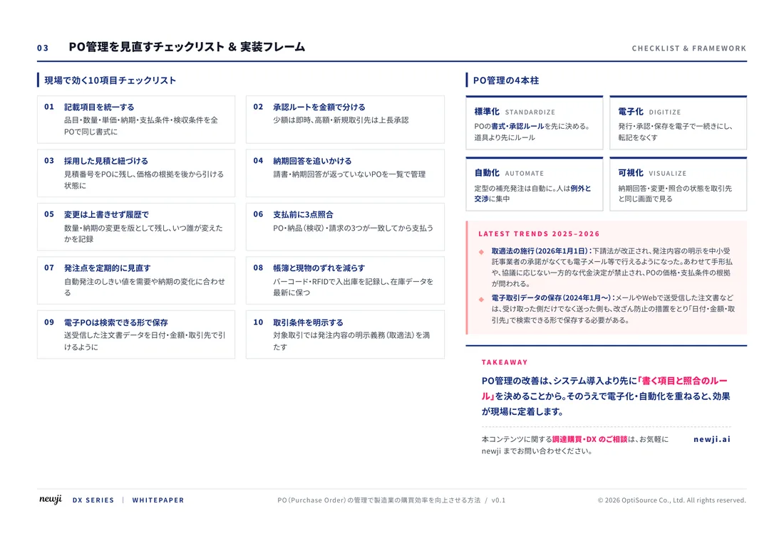
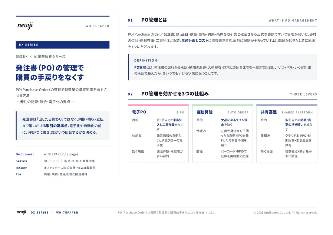
製造業の現場で使える実務資料(PDF)を無料でお届けします。"こんな資料が届きます" ↓ 下のボタンからどうぞ。
FREE DOCUMENT — サービス資料(PDF・無料)
製造業の見積・受発注クラウド
「Newji one」とは
Newji one は、製造業の調達・受発注に特化したクラウド/AIエージェント。見積依頼・発注書作成・進捗管理・承認をひとつの画面に集約し、AIが比較と異常検知を担当。最後の「GO」だけ人が押す仕組みです。
▶ 製造業の見積・受発注クラウド「Newji one」を、資料で見る(PDF・無料)
- 見積〜発注〜納期を一元管理。催促・転記のムダをゼロに
- AIが相見積もり比較と異常検知。あなたは判断だけに集中
- 取引先は「招待」で完全無料。自社コストだけで取引先ごとデジタル化
※ 取引先から招待された企業様は完全無料でご利用いただけます



 NEWJI総研
 OEM/ODM 生産委託
 AI/DX支援
 見積・発注クラウド Newji one
受発注が増えるほど、入力・確認・催促が重くなる。
受発注管理を“仕組み化“して、ミスと工数を削減しませんか。
見積・発注・納期まで一元管理できます。