

- お役立ち記事
- Basics, evaluation, and examples of easy-to-use UI design and screen design

Basics, evaluation, and examples of easy-to-use UI design and screen design

目次
Understanding the Basics of UI and Screen Design
User Interface (UI) design is all about making it easy for people to interact with computers, apps, and websites.
When people talk about UI, they’re often referring to how things look on the screen and how they work when people use them.
A well-designed UI can make a big difference in how much people enjoy using an app or website.
UI design includes the layout, color choices, fonts, and all the buttons or controls people use to do things.
It’s like creating a friendly helper between the user and the computer so everything works smoothly.
Screen design focuses specifically on arranging elements on each screen of an application in a way that’s visually appealing and easy to navigate.
Key Components of Good UI Design
There are several key components that contribute to a successful UI design.
Understanding these can help create a more user-friendly experience.
1. Visual Hierarchy
Visual hierarchy is about arranging elements in a way that the most important information catches the user’s eye first.
Designers use size, color, contrast, and position to influence what users notice first and guide them through the content efficiently.
2. Consistency
Consistency ensures that the design elements are uniform across different screens and devices.
This includes having a consistent style guide for fonts, buttons, and other elements so users can become familiar with the layout.
3. Feedback
Providing feedback is key to informing users about the results of their actions.
Feedback can include changing the button color once clicked, showing a loading spinner, or confirming an action with a message.
These cues reassure users that their actions were successful or advise them if something went wrong.
4. Simplicity
Simplicity is about keeping interfaces uncluttered and straightforward.
It means including only necessary elements that support user interaction, allowing users to complete their tasks easily without distractions.
Evaluating UI Design
Evaluating a UI design involves analyzing how effective it is in terms of usability and user satisfaction.
1. Usability Testing
This is one of the best methods for evaluating UI design.
Usability testing involves real users working through tasks in the design while observers notice where users encounter issues.
The feedback gathered helps make improvements to the design to enhance user satisfaction.
2. User Surveys
After users interact with the UI, surveys can capture their experiences and perceptions.
Questions might focus on ease of use, aesthetic appeal, and how intuitive the interface felt.
3. Analytical Tools
Analytical tools track how users interact with the design, providing data on where they click, how long they stay on pages, and the paths they follow.
This information is invaluable for understanding user behavior and identifying areas for improvement.
Examples of Easy-to-Use UI Designs
Several successful applications have become benchmarks for exemplary UI design due to their intuitive interfaces and pleasant user experiences.
1. Apple iOS
Apple iOS is renowned for its clean and minimalist design.
Icons are consistent across all devices, navigation is intuitive, and there are clear visual cues for different actions.
The attention to detail and simplicity make iOS a preferred choice for many users worldwide.
2. Google Search
Google Search is a great example of simplicity and functionality.
The homepage is clear of distractions, with only the search bar visible.
The simple design helps users focus on their primary task, which is searching for information.
3. Airbnb
The Airbnb app is designed with a user-centric approach, focusing on imagery and seamless navigation.
The design is intuitive, with a search bar, clear categories, and rich visuals that guide users effortlessly.
User feedback mechanisms are built into the design, allowing for continuous improvement.
4. Slack
Slack’s interface is simple but powerful, emphasizing communication and collaboration.
It integrates feedback through notifications and is highly customizable to meet the specific needs of different teams.
Users can effortlessly navigate through channels and manage their conversations.
Conclusion
Understanding and implementing the basics of UI and screen design can significantly enhance user experience.
By focusing on visual hierarchy, maintaining consistency, providing feedback, and ensuring simplicity, designers can create intuitive and appealing interfaces.
Evaluating designs through testing, surveys, and analytics ensures these interfaces meet user needs and expectations.
Looking at successful applications provides valuable insights into effective design principles.
By focusing on user-centric design, developers can make their applications more accessible and enjoyable to use.
この記事の理解を深める
無料ホワイトペーパーをプレゼント
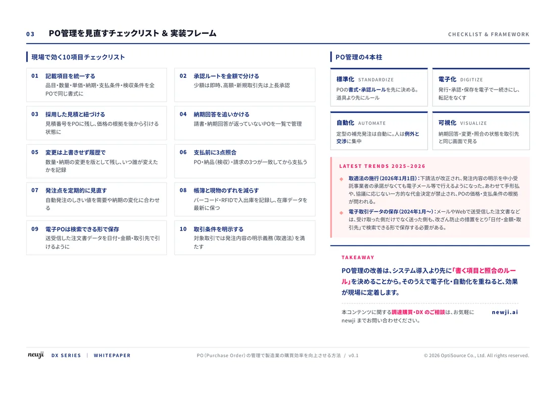
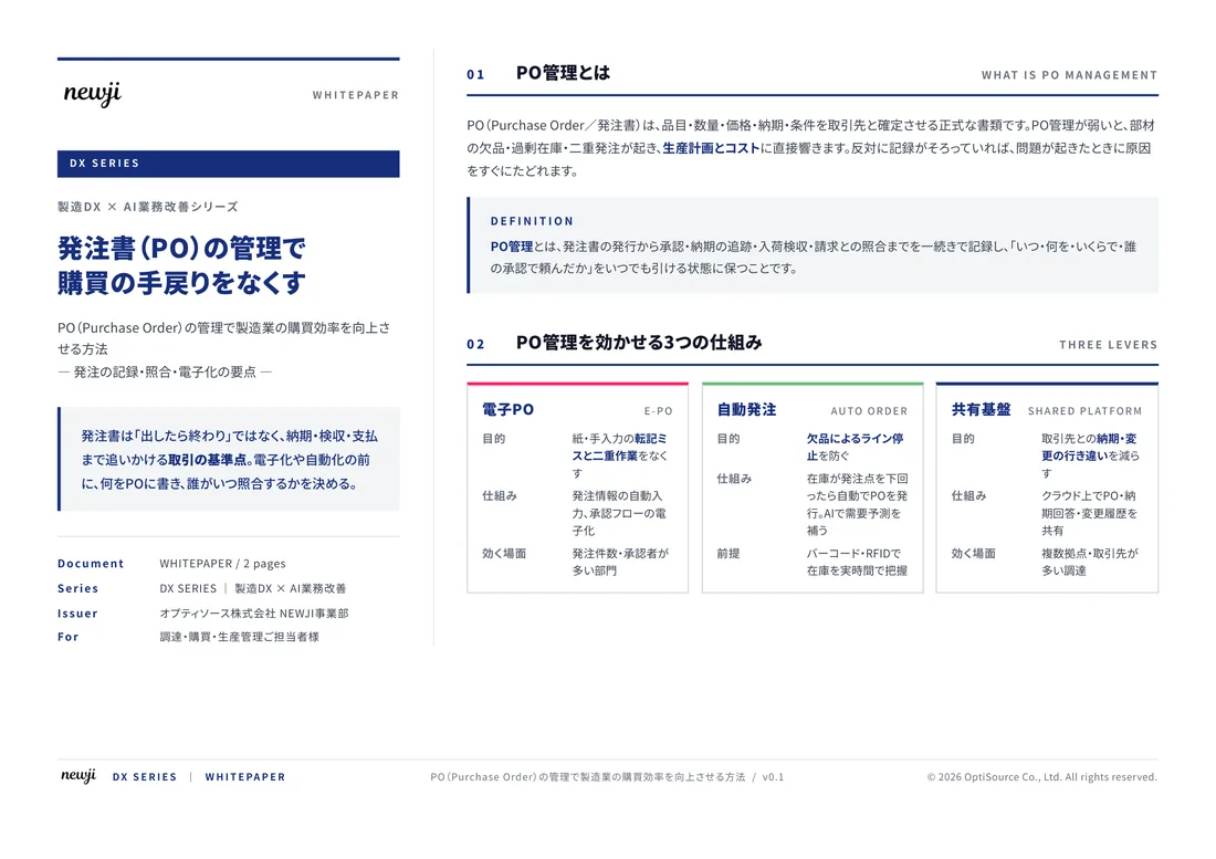
製造業の現場で使える実務資料(PDF)を無料でお届けします。"こんな資料が届きます" ↓ 下のボタンからどうぞ。
FREE DOCUMENT — サービス資料(PDF・無料)
製造業の見積・受発注クラウド
「Newji one」とは
Newji one は、製造業の調達・受発注に特化したクラウド/AIエージェント。見積依頼・発注書作成・進捗管理・承認をひとつの画面に集約し、AIが比較と異常検知を担当。最後の「GO」だけ人が押す仕組みです。
▶ 製造業の見積・受発注クラウド「Newji one」を、資料で見る(PDF・無料)
- 見積〜発注〜納期を一元管理。催促・転記のムダをゼロに
- AIが相見積もり比較と異常検知。あなたは判断だけに集中
- 取引先は「招待」で完全無料。自社コストだけで取引先ごとデジタル化
※ 取引先から招待された企業様は完全無料でご利用いただけます


 NEWJI総研
 OEM/ODM 生産委託
 AI/DX支援
 見積・発注クラウド Newji one
受発注が増えるほど、入力・確認・催促が重くなる。
受発注管理を“仕組み化“して、ミスと工数を削減しませんか。
見積・発注・納期まで一元管理できます。