

- お役立ち記事
- Practice of user-friendly and easy-to-use interface development and its application examples

スタートアップから大手まで。
調達・受発注をAIで標準化。
相見積比較も進捗管理もAIが下支え。取引先は招待で完全無料。

Practice of user-friendly and easy-to-use interface development and its application examples

目次
Understanding User-Friendly Interface Design
Creating a user-friendly and easy-to-use interface involves designing a platform that is intuitive, efficient, and allows users to achieve their goals with minimal effort.
A user-friendly interface minimizes the learning curve for new users, making it accessible to a wider audience.
This concept is essential in enhancing user satisfaction and engagement.
User-friendly interface design emphasizes simplicity and clarity.
Each element in the interface should serve a purpose, guiding the user effortlessly through the application.
This involves thoughtful placement of interactive elements such as buttons, menus, and navigation tools.
Key Principles of User-Friendly Interface Design
Here are some fundamental principles to consider when developing interfaces that are both user-friendly and easy to use:
1. **Simplicity and Clarity**: Remove unnecessary elements and focus on essential functions.
Use clear language and simple designs to guide users intuitively.
2. **Consistency**: Maintain consistency in your interface design by using similar patterns and styles across different pages.
This helps users predict and understand the interface quickly.
3. **Feedback**: Provide immediate and clear feedback for user actions.
For instance, a button click could be followed by a visual or auditory response, confirming the action taken.
4. **Error Prevention and Handling**: Design in a way that prevents errors whenever possible.
When errors occur, provide clear, actionable messages to help users resolve the issue.
5. **Accessibility**: Consider users with disabilities by incorporating features like screen readers and keyboard navigation.
This broadens your user base and ensures inclusivity.
Challenges in Designing User-Friendly Interfaces
Despite the obvious advantages of user-friendly interfaces, designers often face several challenges.
It’s crucial to balance aesthetics with functionality, ensuring the interface is both attractive and efficient.
In some cases, designers may focus too heavily on aesthetics, leading to complex interfaces that can confuse users.
Additionally, understanding user needs is not always straightforward.
Designers must research and iterate design solutions based on real user feedback and behavior.
Another challenge is ensuring compatibility across different devices and platforms.
A user-friendly interface on a desktop might perform poorly on a mobile device if not properly adapted.
Solutions to Overcome Design Challenges
To overcome these challenges, here are some strategies:
– **User Testing and Feedback**: Engage with real users during the design process through surveys, usability tests, and interviews.
This provides valuable insights into user behavior and preferences, allowing for more informed design decisions.
– **Adaptive Design**: Focus on responsive and adaptive design techniques to ensure your interface works seamlessly across various devices and screen sizes.
– **Iterative Design Process**: Adopt an iterative approach to design.
Continuously improve the interface by implementing user feedback and analyzing usage patterns.
– **Training and Development**: Keep your design team updated with the latest trends and tools in UI/UX design.
This ensures that your solutions leverage current best practices and technologies.
Application Examples of User-Friendly Interface Design
To see user-friendly interface design in action, consider these real-world examples:
Example 1: Google Search
Google Search is an excellent example of simplicity and efficiency.
Its minimalistic design ensures users can quickly access the search bar and relevant results without distractions.
The interface is consistent and offers useful features such as instant search suggestions and filters.
Example 2: Apple iOS
Apple’s iOS interface is renowned for its intuitive design.
The seamless integration of hardware and software creates an effortless user experience.
Features like consistent app icons, well-organized menus, and easy-to-navigate settings make iOS highly user-friendly.
Example 3: Airbnb
Airbnb’s platform is designed with the user journey in mind.
The interface offers simple navigation, clear calls-to-action, and personalized recommendations, making it easy for users to find and book accommodations.
The booking process is straightforward, showcasing effective feedback and error prevention techniques.
Example 4: Slack
Slack provides a communication platform with a clean, user-centric interface.
Its design helps teams collaborate effectively through organized channels, instant notifications, and user-friendly integrations.
Features like keyboard shortcuts and a straightforward search function enhance productivity.
Conclusion
Developing a user-friendly and easy-to-use interface involves balancing simplicity, functionality, and aesthetics.
By adhering to the principles of user-friendly design and overcoming common challenges, you can create interfaces that enhance user satisfaction and engagement.
Leveraging real user feedback and adopting iterative design processes are crucial steps in refining and optimizing your interface.
Observing best practices from leading examples such as Google, Apple, Airbnb, and Slack can offer valuable insights and inspiration for your design projects.
この記事の理解を深める
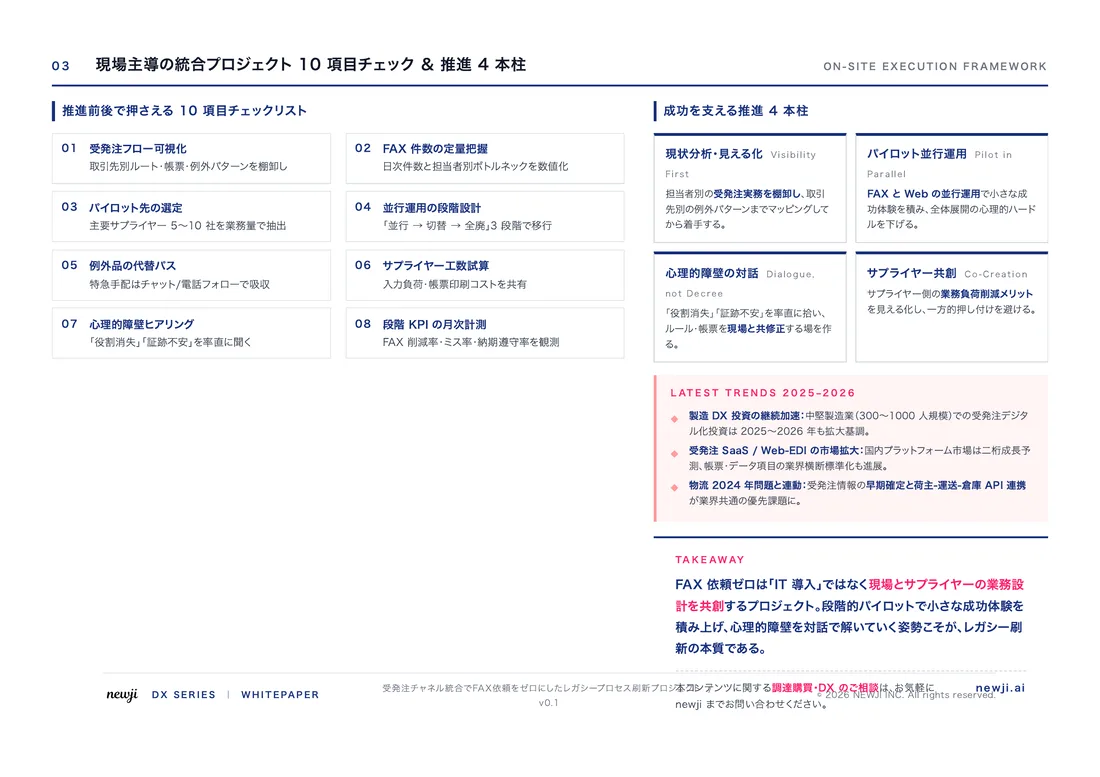
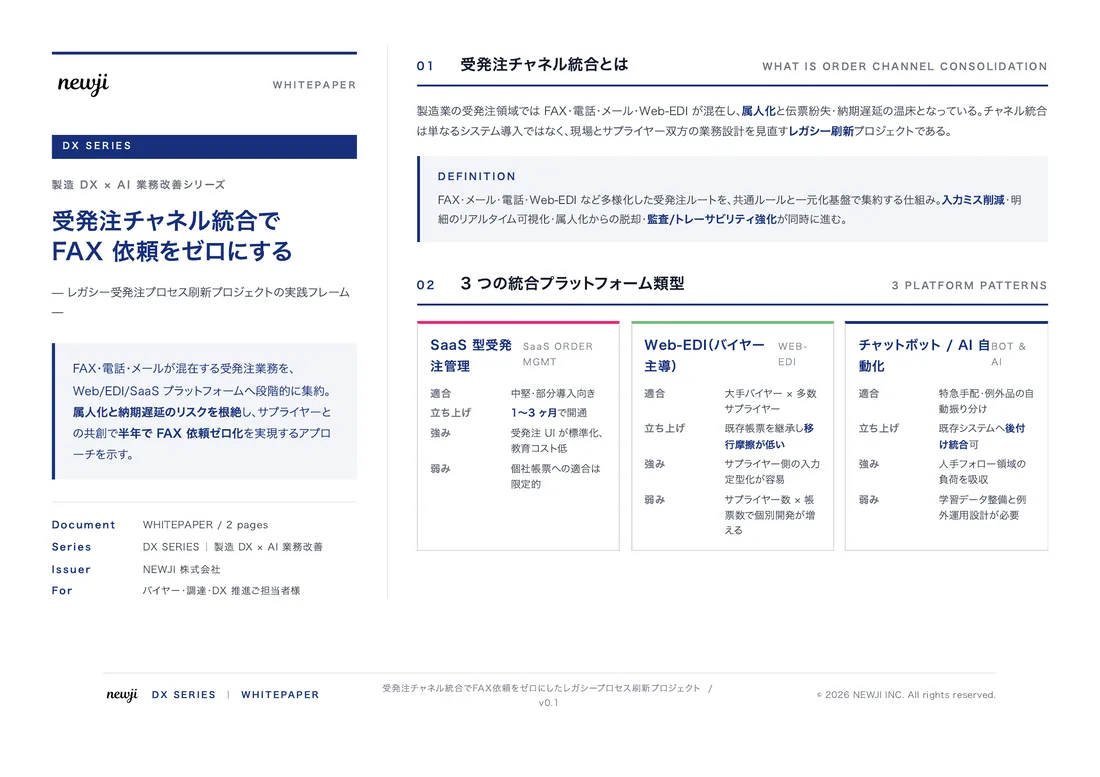
無料ホワイトペーパーをプレゼント
製造業の現場で使える実務資料(PDF)を無料でお届けします。"こんな資料が届きます" ↓ 下のボタンからどうぞ。
PRODUCT — 製造業向け 調達・受発注クラウド
この記事の課題、
newji で解決しませんか?
newji は、製造業の調達・受発注に特化したクラウド/AIエージェント。見積依頼・発注書作成・進捗管理・承認をひとつの画面に集約し、AIが比較と異常検知を担当。最後の「GO」だけ人が押す仕組みです。
- 見積〜発注〜納期を一元管理。催促・転記のムダをゼロに
- AIが相見積もり比較と異常検知。あなたは判断だけに集中
- 取引先は「招待」で完全無料。自社コストだけで取引先ごとデジタル化
※ 取引先から招待された企業様は完全無料でご利用いただけます




 調達購買アウトソーシング
 OEM/ODM 生産委託
 NEWJI DX
 受発注AIエージェント