

- お役立ち記事
- Descriptive statistics and data visualization in Python

その単価は妥当か。
AI が根拠付きで分析。
相見積の比較も発注も進捗管理も、ひとつの画面に。

Descriptive statistics and data visualization in Python

目次
Introduction to Descriptive Statistics and Data Visualization in Python
Descriptive statistics and data visualization are fundamental tools for anyone working with data.
They help transform raw data into meaningful insights, aiding in better understanding and decision-making.
Python, a versatile programming language, offers a range of libraries and functions to facilitate these processes.
This article will guide you through the basics of descriptive statistics and data visualization in Python.
Understanding Descriptive Statistics
Descriptive statistics provide a simple summary of the main features of a dataset.
These statistics offer a way to describe the central tendency, dispersion, and shape of the dataset’s distribution.
Measures of Central Tendency
1. **Mean**: The mean, often referred to as the average, is obtained by adding all the numbers in a dataset and dividing by the number of data points.
2. **Median**: The median is the middle value when the numbers are sorted in ascending order.
If there’s an even number of observations, the median is the average of the two central numbers.
3. **Mode**: The mode is the value that appears most frequently in the dataset.
A set of numbers can have one mode, more than one mode, or no mode at all.
Measures of Dispersion
1. **Range**: The range is the difference between the maximum and minimum values in the dataset.
It shows how spread out the data values are.
2. **Variance**: Variance measures how much the data points differ from the mean.
A high variance means the numbers are widely spread out.
3. **Standard Deviation**: The standard deviation is the square root of variance.
It indicates how much individual data points deviate from the mean.
Measures of Shape
1. **Skewness**: Skewness measures the asymmetry of a dataset’s distribution.
A positive skew indicates a long tail on the right, while a negative skew indicates a long tail on the left.
2. **Kurtosis**: Kurtosis measures the “tailedness” of the distribution.
High kurtosis means more of the variance is due to infrequent extreme deviations.
Data Visualization in Python
Data visualization is the graphical representation of data, allowing for better analysis and interpretation.
Python offers several libraries for creating stunning visualizations.
Popular Python Libraries for Data Visualization
1. **Matplotlib**: This library provides a low-level interface for drawing 2D graphics.
It is highly customizable and is the foundation of many other visualization libraries.
2. **Seaborn**: Built on top of Matplotlib, Seaborn is a statistical data visualization library that makes it easy to create informative and attractive graphics.
3. **Pandas Visualization**: Pandas offer built-in plotting capabilities that integrate well with DataFrame, making it easy to create quick visualizations.
4. **Plotly**: Plotly is a popular interactive graphing library.
It allows users to create complex visualizations like 3D plots and interactive graphs.
Creating a Simple Plot with Matplotlib
To create a simple line plot using Matplotlib, here’s a quick example:
“`python
import matplotlib.pyplot as plt
x_values = [0, 1, 2, 3, 4, 5]
y_values = [0, 1, 4, 9, 16, 25]
plt.plot(x_values, y_values)
plt.title(‘Simple Line Plot’)
plt.xlabel(‘X Values’)
plt.ylabel(‘Y Values’)
plt.show()
“`
This script generates a straightforward line plot with a title and axis labels.
Enhancing Visualizations with Seaborn
Seaborn makes it easier to enhance Matplotlib plots with its simple interface.
For example, creating a scatter plot with Seaborn:
“`python
import seaborn as sns
import matplotlib.pyplot as plt
tips = sns.load_dataset(‘tips’)
sns.scatterplot(x=’total_bill’, y=’tip’, data=tips)
plt.title(‘Total Bill vs. Tip’)
plt.show()
“`
Seaborn handles the dataset loading and plotting effortlessly and offers additional plotting tools not available in Matplotlib.
Combining Descriptive Statistics and Visualizations
Combining descriptive statistics with visualizations provides a comprehensive understanding of your data.
For instance, visualizing the distribution of data along with mean and median lines can offer insights into data skewness and variability.
Here’s an example:
“`python
import numpy as np
import seaborn as sns
import matplotlib.pyplot as plt
data = np.random.normal(loc=0, scale=1, size=1000)
sns.histplot(data, bins=30, kde=True)
plt.axvline(np.mean(data), color=’r’, linestyle=’dashed’, label=’Mean’)
plt.axvline(np.median(data), color=’g’, linestyle=’dotted’, label=’Median’)
plt.legend()
plt.title(‘Data Distribution with Mean and Median’)
plt.show()
“`
This histogram, completed with kernel density estimation (KDE), illustrates the dataset’s distribution, and the vertical lines denote the mean and median.
Conclusion
Descriptive statistics and data visualization are essential skills for analyzing data effectively.
By leveraging Python’s powerful libraries like Matplotlib and Seaborn, you can gain significant insights and make informed decisions.
Whether you’re just starting with data analysis or looking to enhance your skills, understanding these foundational concepts is vital.
With continued practice, you’ll find it increasingly intuitive to extract and communicate insights from data using Python.
この記事の理解を深める
無料ホワイトペーパーをプレゼント
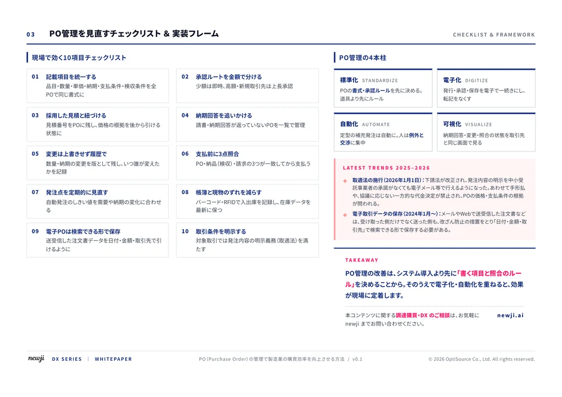
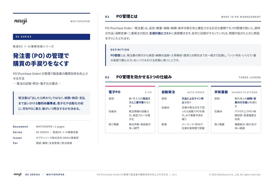
製造業の現場で使える実務資料(PDF)を無料でお届けします。"こんな資料が届きます" ↓ 下のボタンからどうぞ。
FREE DOCUMENT — サービス資料(PDF・無料)
製造業の見積・受発注クラウド
「Newji one」とは
Newji one は、製造業の調達・受発注に特化したクラウド/AIエージェント。見積依頼・発注書作成・進捗管理・承認をひとつの画面に集約し、AIが比較と異常検知を担当。最後の「GO」だけ人が押す仕組みです。
▶ 製造業の見積・受発注クラウド「Newji one」を、資料で見る(PDF・無料)
- 見積〜発注〜納期を一元管理。催促・転記のムダをゼロに
- AIが相見積もり比較と異常検知。あなたは判断だけに集中
- 取引先は「招待」で完全無料。自社コストだけで取引先ごとデジタル化
※ 取引先から招待された企業様は完全無料でご利用いただけます


 NEWJI総研
 OEM/ODM 生産委託
 AI/DX支援
 見積・発注クラウド Newji one
受発注が増えるほど、入力・確認・催促が重くなる。
受発注管理を“仕組み化“して、ミスと工数を削減しませんか。
見積・発注・納期まで一元管理できます。