

- お役立ち記事
- Easy-to-understand and easy-to-use interface design and usability guidelines

その単価は妥当か。
AI が根拠付きで分析。
相見積の比較も発注も進捗管理も、ひとつの画面に。

Easy-to-understand and easy-to-use interface design and usability guidelines

目次
Understanding Interface Design
Interface design is a crucial aspect of any digital product, whether it’s a website, an application, or a software program.
It involves creating layouts, features, and visual elements that users interact with.
The goal of interface design is to facilitate easy and efficient user interactions.
This means designing interfaces that are intuitive and straightforward so users can complete tasks without unnecessary confusion or frustration.
A well-designed interface should be familiar to users, with elements that are easy to recognize and use.
For example, buttons should look clickable, tabs should resemble tabs, and icons should effectively communicate their purpose.
These familiar elements enhance usability because users are often already acquainted with these design patterns.
The Importance of Usability
Usability revolves around user-friendly design.
It evaluates how easy and effective an interface is for users to navigate and complete tasks.
An interface that scores high on usability allows users to achieve their goals with minimal effort and time.
Usability is vital because even the most advanced features and beautiful designs are rendered useless if users cannot navigate or understand how to use them.
For instance, think about a website where the checkout button is hard to find during online shopping.
Even with a fantastic product range, poor usability may restrict sales and user satisfaction.
Principles of Effective Interface Design
To create interfaces that are both easy to understand and use, designers should follow several key principles.
Consistency
Consistency is essential for user learning and satisfaction.
Maintain a uniform look and behavior across all interface components.
This includes using consistent colors, fonts, and styles for similar elements and ensuring that functions behave similarly in different parts of the application.
Clarity
Design elements should communicate their purpose to users clearly.
Use plain language and visuals to guide users, avoiding jargon or complex terminology that could confuse non-experts.
Labels on buttons and icons should be straightforward and self-explanatory.
Feedback
Providing instant feedback helps users understand the result of their actions.
This can be as simple as a button changing color when clicked, or a more complex response like a message that confirms a successful transaction.
Feedback ensures users know their actions have been recognized and processed.
Affordance
Affordance refers to the perceived function of an element based on its appearance.
Design elements should look simple and intuitive so users understand how to interact with them effortlessly.
For instance, a button should look pressable, and a scroll bar should be distinct and easily movable.
Usability Guidelines
Prioritize the User’s Goals
Identify what users want to accomplish and design the interface to help them reach their goals smoothly.
This might involve creating shortcuts for frequent tasks or placing important actions in easily accessible locations.
Understanding user personas and employing user testing can be beneficial in this process.
Emphasize Accessibility
An accessible interface ensures everyone, including those with disabilities, can use a product effectively.
This involves designing with considerations for people who may have difficulties with vision, hearing, movement, or cognitive functions.
Offer Help and Documentation
Even with the utmost attention to usability, users may still encounter issues or need assistance.
Providing accessible help resources, such as tutorials and clear documentation, can support users in overcoming challenges and provide additional guidance.
Best Practices for Usability Testing
Perform Regular Testing
Usability testing should be an ongoing process throughout the design and development stages.
Regular testing allows designers to identify and rectify user problems before they become widespread.
Engage Real Users
Involve actual users in the testing process to gather authentic feedback on design and functionality.
Observing real users interact with the interface can uncover issues designers might overlook, ensuring the product caters effectively to its intended audience.
Iterate Based on Feedback
Use the insights gained from usability testing to refine and improve the interface continuously.
Iterative design ensures the final product is polished and caters to user needs effectively.
Conclusion
Creating an interface that balances compelling design with intuitive usability is a crucial task for any designer.
By adhering to the principles of consistency, clarity, feedback, and affordance, designers can create interfaces that are both functional and appealing.
Prioritizing usability and conducting regular usability testing ensure that digital products are accessible and enjoyable for all users.
Ultimately, a focus on user-centric design will lead to interfaces that not only meet user needs but also enhance the overall user experience.
この記事の理解を深める
無料ホワイトペーパーをプレゼント
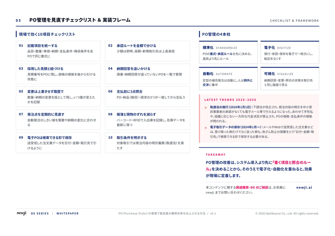
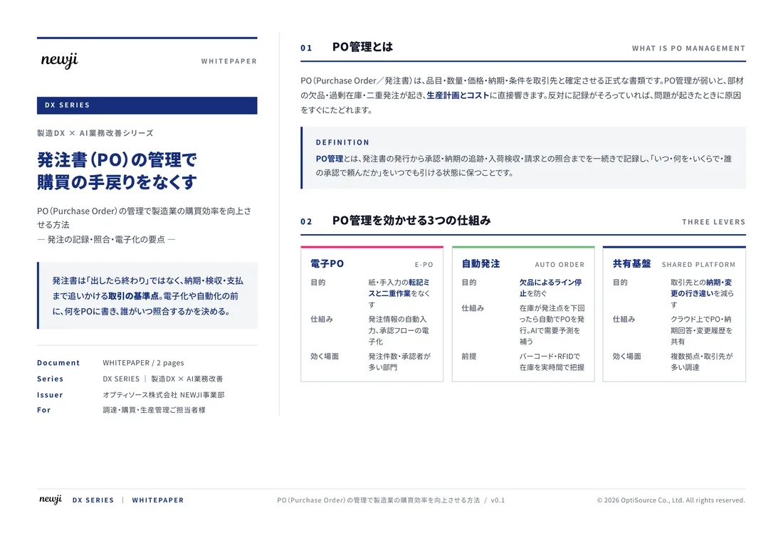
製造業の現場で使える実務資料(PDF)を無料でお届けします。"こんな資料が届きます" ↓ 下のボタンからどうぞ。
FREE DOCUMENT — サービス資料(PDF・無料)
製造業の見積・受発注クラウド
「Newji one」とは
Newji one は、製造業の調達・受発注に特化したクラウド/AIエージェント。見積依頼・発注書作成・進捗管理・承認をひとつの画面に集約し、AIが比較と異常検知を担当。最後の「GO」だけ人が押す仕組みです。
▶ 製造業の見積・受発注クラウド「Newji one」を、資料で見る(PDF・無料)
- 見積〜発注〜納期を一元管理。催促・転記のムダをゼロに
- AIが相見積もり比較と異常検知。あなたは判断だけに集中
- 取引先は「招待」で完全無料。自社コストだけで取引先ごとデジタル化
※ 取引先から招待された企業様は完全無料でご利用いただけます





 NEWJI総研
 OEM/ODM 生産委託
 AI/DX支援
 見積・発注クラウド Newji one
受発注が増えるほど、入力・確認・催促が重くなる。
受発注管理を“仕組み化“して、ミスと工数を削減しませんか。
見積・発注・納期まで一元管理できます。