

- お役立ち記事
- Illustrations and color scheme tips

その単価は妥当か。
AI が根拠付きで分析。
相見積の比較も発注も進捗管理も、ひとつの画面に。

Illustrations and color scheme tips

目次
Understanding the Basics of Illustrations
Illustrations are artistic images or drawings that help to tell a story or convey a message visually.
They can be found in books, magazines, advertisements, websites, and many other places.
Illustrations are a powerful tool because they can explain complex ideas quickly and engagingly.
There are many styles of illustrations.
Some are realistic, showing things as they are in real life.
Others are more abstract, using shapes and colors to represent ideas and feelings.
No matter the style, all illustrations share the goal of enhancing the viewer’s understanding or enjoyment of the content they accompany.
The Importance of Color in Illustrations
Color is an essential part of illustrations.
It helps to set the mood, attract attention, and communicate information.
Imagine a storybook illustrated in black and white versus one full of vivid colors.
The colorful book might feel more exciting and joyful, instantly capturing the reader’s interest.
In illustrations, colors can suggest different emotions and meanings.
For example, red might convey passion or danger, while blue can feel calm or cool.
Understanding how colors work together and their impact on emotions can help create more effective and appealing illustrations.
Tips for Choosing Illustrations
When selecting illustrations, it’s important to think about the story or message you want to convey.
Consider the audience.
Are they children, teenagers, or adults?
Each group may respond differently to certain styles and colors.
Selecting the Right Style
Consider whether a realistic or abstract style is more appropriate for what you’re trying to communicate.
Realistic illustrations work well for educational content where accuracy is crucial.
On the other hand, more abstract or stylized illustrations might be better for emotional or imaginative stories.
Matching Illustrations to Your Message
Ensure the illustrations you choose match the tone and purpose of the content.
For example, a serious subject might not suit bright, whimsical images.
Instead, choose illustrations that reinforce your message and help the viewer connect with the content more deeply.
Effective Use of Color in Illustrations
A well-chosen color scheme can make your illustrations more compelling and meaningful.
Here are some tips to use color effectively:
Choose a Color Palette
A color palette is a set of colors that are used in a design.
Having a defined palette helps to create consistency and harmony in your illustrations.
Think about the mood you want to set and choose colors that support that feeling.
There are tools online that can help you generate a color palette if you’re unsure where to start.
Understand Color Relationships
Learn about the color wheel and how different colors relate to each other.
Complementary colors are opposite each other on the wheel and can create vibrant looks when paired together.
Analogous colors are next to each other and can create a harmonious and pleasing result.
Consider Color Psychology
Colors can evoke different emotions and reactions.
Think about what you want the audience to feel and choose colors that support those feelings.
Soft pastels might make an illustration feel gentle or dreamy, while bold primary colors can make it feel more energetic and lively.
Use Contrast to Highlight Key Elements
Contrast helps important parts of your illustration stand out.
By using light and dark colors effectively, you can guide the viewer’s attention to the most crucial elements of your illustration.
Balancing Illustrations and Text
When using illustrations alongside text, it’s important to find the right balance so that both can effectively communicate the message.
Ensure Readability
Make sure that illustrations do not overpower the text.
Text should be easily readable and not lost among vibrant images.
Using illustrations to complement the text can enhance understanding without causing distraction.
Arrange Layout Thoughtfully
Arrange illustrations and text in a balanced way.
Consider placement, size, and spacing to ensure a harmonious design.
Good layout makes it easy for the reader to navigate through and understand the content.
Conclusion
Illustrations and color schemes play a significant role in storytelling and message delivery.
Whether you are illustrating a children’s book or designing an advertisement, choosing the right style and colors can make all the difference.
By understanding the basics of illustration, selecting suitable visuals, and effectively using color, you can create engaging, memorable, and meaningful content.
Remember to balance your illustrations with text to create a clear and accessible message for your audience.
この記事の理解を深める
無料ホワイトペーパーをプレゼント
製造業の現場で使える実務資料(PDF)を無料でお届けします。"こんな資料が届きます" ↓ 下のボタンからどうぞ。
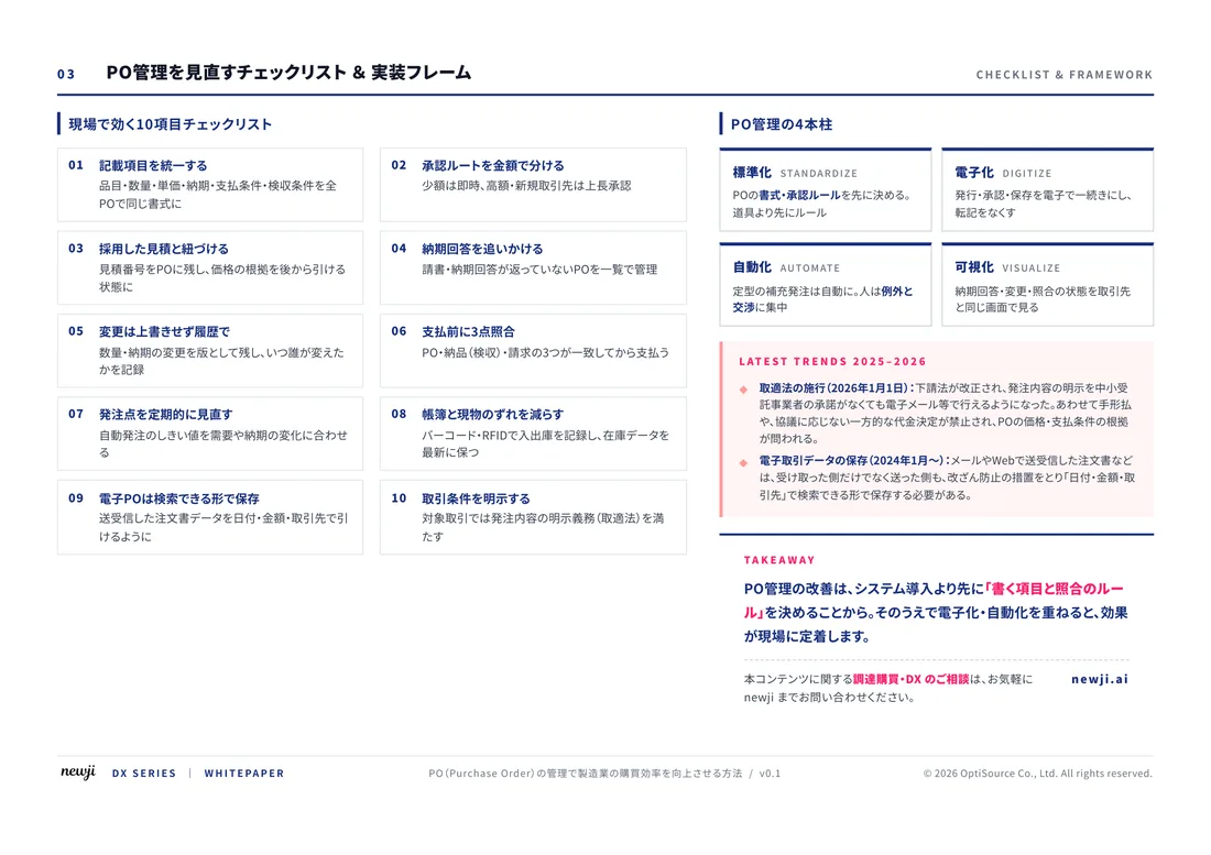
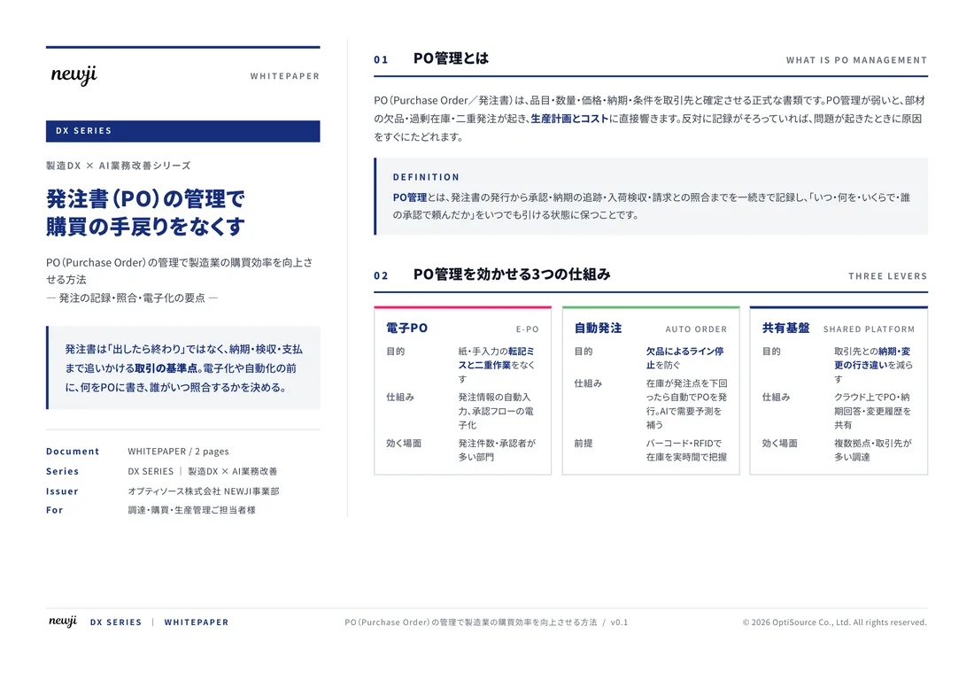
FREE DOCUMENT — サービス資料(PDF・無料)
製造業の見積・受発注クラウド
「Newji one」とは
Newji one は、製造業の調達・受発注に特化したクラウド/AIエージェント。見積依頼・発注書作成・進捗管理・承認をひとつの画面に集約し、AIが比較と異常検知を担当。最後の「GO」だけ人が押す仕組みです。
▶ 製造業の見積・受発注クラウド「Newji one」を、資料で見る(PDF・無料)
- 見積〜発注〜納期を一元管理。催促・転記のムダをゼロに
- AIが相見積もり比較と異常検知。あなたは判断だけに集中
- 取引先は「招待」で完全無料。自社コストだけで取引先ごとデジタル化
※ 取引先から招待された企業様は完全無料でご利用いただけます
関連記事
-

購買管理システム比較23選 製造業調達購買部門必見
-

半導体にはどのような電子部品が搭載されているのか?
-

Improving Customer Satisfaction The Importance of Customization and Flexibility in Manufacturing
-
Digital Workflow in Manufacturing! A Smart Approach to Transform Productivity
-
Reducing Lead Times How to Make Manufacturing Processes More Efficient
-
関市の切削技術イノベーション 地元企業が牽引する製造業の未来
 NEWJI総研
 OEM/ODM 生産委託
 AI/DX支援
 見積・発注クラウド Newji one
受発注が増えるほど、入力・確認・催促が重くなる。
受発注管理を“仕組み化“して、ミスと工数を削減しませんか。
見積・発注・納期まで一元管理できます。