

- お役立ち記事
- Basics of data analysis using Tableau and how to use it effectively

その単価は妥当か。
AI が根拠付きで分析。
相見積の比較も発注も進捗管理も、ひとつの画面に。

Basics of data analysis using Tableau and how to use it effectively

目次
What is Tableau?
Tableau is a powerful data visualization tool used for transforming raw data into understandable formats.
It enables users to create interactive and shareable dashboards, which depict trends, variations, and density of data in the form of interactive graphs and charts.
It’s particularly well-suited for individuals looking to gain insights and make data-driven decisions without deep technical expertise.
Why Choose Tableau for Data Analysis?
Tableau is renowned for its user-friendly interface, allowing users to drag and drop elements to create comprehensive visualizations.
It supports various data sources including spreadsheets, databases, and big data.
This adaptability makes it a popular choice across industries.
Furthermore, Tableau is equipped with real-time data analytics capabilities.
This allows businesses to act swiftly on insights as soon as data gets updated.
Additionally, Tableau’s impressive community and resources make it easier for beginners to learn and troubleshoot issues.
Getting Started with Tableau
To embark on your data analysis journey with Tableau, you need to follow a few simple steps:
Install Tableau
First, download and install Tableau Desktop from the official website.
Tableau offers a free trial version that you can use to explore its features.
Connect to Data Sources
Tableau allows you to connect to various data sources.
You can link your Excel sheets, SQL databases, web data connectors, and even cloud services like Google Analytics.
Open Tableau Desktop and click on ‘Connect’ to select your data source.
Create a Worksheet
Once your data is loaded, Tableau provides you with a workspace to create visualizations.
The workspace consists of sheets, dashboards, and stories where the magic of data visualization happens.
Select ‘Sheet 1’ to start creating your first visualization.
Build Visualizations with Drag-and-Drop Interface
Tableau’s drag-and-drop interface is both intuitive and powerful.
To create a chart, drag fields from your data pane onto the columns and rows shelves.
Use the ‘Show Me’ panel to access a gallery of chart types.
It suggests visualizations based on the data fields you’ve selected.
Enhance Your Visualization with Filters and Formatting
Adding filters can enhance your visualization by allowing users to focus on specific data points.
Click on the ‘Filter’ option to add necessary filters to your worksheet.
Formatting options present in Tableau enable you to customize the look and feel of your chart for better readability.
Creating Dashboards and Stories
Once individual visualizations are ready, you can combine them into dashboards.
Design a Dashboard
In the Dashboard view, you can position multiple visualizations on a single screen.
Arrange them using the drag-and-drop method.
You can also configure interactive components like filters and actions that link each visualization for dynamic data exploration.
Create a Story
To weave a narrative with your data, you can use the Story feature.
This allows you to create a sequence of visualizations, enhancing your presentation.
It’s invaluable when you want to communicate insights through a cohesive narrative.
Effective Usage of Tableau
Using Tableau effectively involves a combination of best practices and exploration.
Understand Your Audience
Always tailor your visualizations to meet the needs and understanding of your audience.
Different audiences may require different levels of detail or complexity.
Focus on Clarity
Strive for clarity over complexity in your visualizations.
Ensure that colors, labels, and legends are used consistently and effectively to avoid confusion.
Keep Exploring Features
Tableau is packed with features, some of which you might not discover at first glance.
Regularly explore Tableau’s advanced features like calculated fields, parameters, and map visualizations.
Utilize Tableau’s Community and Resources
Tableau’s community forums, webinars, and online courses are invaluable for learning and troubleshooting.
Engage with these resources regularly to refine your skills.
Conclusion
Tableau remains a top choice for data analysts due to its simplicity and powerful features.
With its ability to connect to diverse data sources and create interactive visualizations, Tableau is a tool that can help extract meaningful insights from complex data.
By following these basics and integrating effective usage practices, you can enhance your data analysis projects and drive better decision-making in your profession or business.
この記事の理解を深める
無料ホワイトペーパーをプレゼント
製造業の現場で使える実務資料(PDF)を無料でお届けします。"こんな資料が届きます" ↓ 下のボタンからどうぞ。
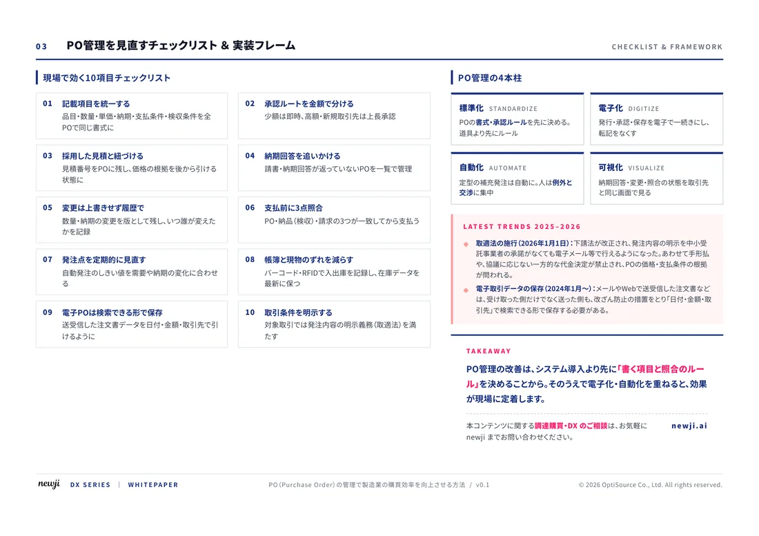
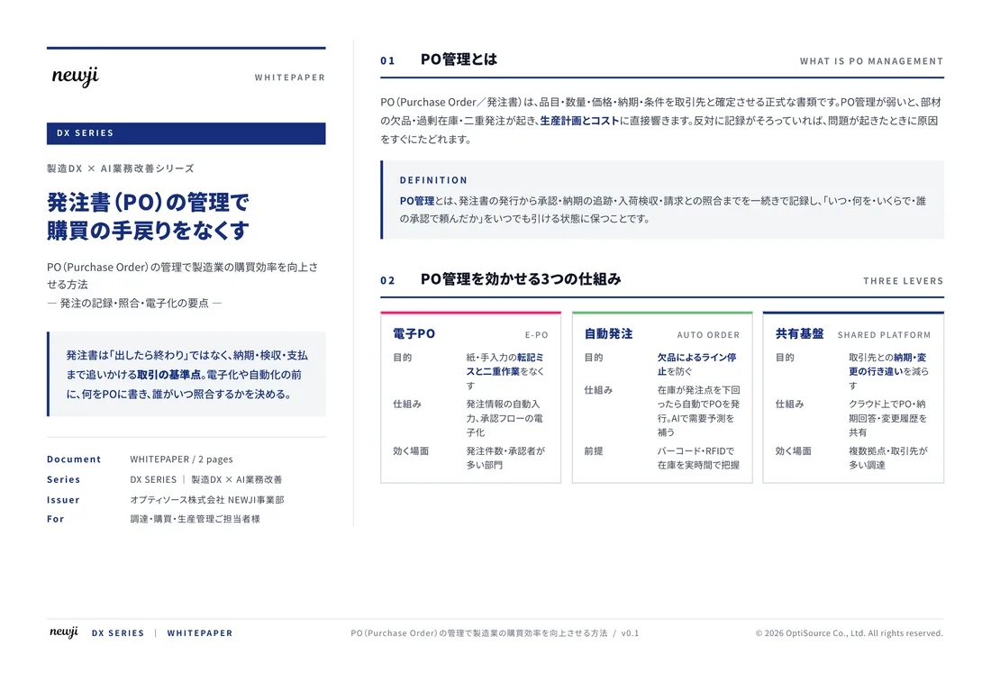
FREE DOCUMENT — サービス資料(PDF・無料)
製造業の見積・受発注クラウド
「Newji one」とは
Newji one は、製造業の調達・受発注に特化したクラウド/AIエージェント。見積依頼・発注書作成・進捗管理・承認をひとつの画面に集約し、AIが比較と異常検知を担当。最後の「GO」だけ人が押す仕組みです。
▶ 製造業の見積・受発注クラウド「Newji one」を、資料で見る(PDF・無料)
- 見積〜発注〜納期を一元管理。催促・転記のムダをゼロに
- AIが相見積もり比較と異常検知。あなたは判断だけに集中
- 取引先は「招待」で完全無料。自社コストだけで取引先ごとデジタル化
※ 取引先から招待された企業様は完全無料でご利用いただけます

 NEWJI総研
 OEM/ODM 生産委託
 AI/DX支援
 見積・発注クラウド Newji one
受発注が増えるほど、入力・確認・催促が重くなる。
受発注管理を“仕組み化“して、ミスと工数を削減しませんか。
見積・発注・納期まで一元管理できます。