

- お役立ち記事
- Data Visualization Technology and Its Industrial Applications

その単価は妥当か。
AI が根拠付きで分析。
相見積の比較も発注も進捗管理も、ひとつの画面に。

Data Visualization Technology and Its Industrial Applications

目次
Introduction to Data Visualization
Data visualization is a technique used to present data in a graphical format.
It allows for easier understanding, analysis, and interpretation of large and complex datasets.
Graphs, charts, and maps are common tools used in data visualization.
The technology helps uncover patterns, trends, and insights that are not immediately obvious in raw data.
Many industries leverage data visualization to make informed decisions and optimize their operations.
Importance of Data Visualization in Modern Industries
Data visualization plays a critical role in today’s data-driven world.
It helps businesses and organizations turn data into actionable insights.
Visual representations of data can highlight changes, trends, and anomalies quickly, compared to raw data.
This assists stakeholders in making quicker and more accurate decisions.
Enhanced Decision-Making
When data is presented visually, it becomes easier to understand.
Executives and decision-makers can see patterns, trends, and outliers at a glance.
This immediate comprehension leads to faster and more effective decision-making.
Organizations can thus stay competitive by responding promptly to market changes and consumer demands.
Easier Communication
Data visualization simplifies complex data, making it accessible to a broad audience.
Whether presenting to a board of directors or explaining a concept to customers, visual data can be more persuasive and memorable.
This is particularly useful in marketing, education, and any field requiring clear communication of data-driven ideas.
Increased Efficiency
Analyzing raw data can be time-consuming and challenging.
Data visualization tools allow analysts to sort through large datasets quickly.
Interactive dashboards and real-time visualizations enable continuous monitoring and immediate analysis.
This boosts operational efficiency and allows for proactive management.
Data Visualization Techniques and Tools
Various techniques and tools are available to create effective data visualizations.
Types of Data Visualizations
There are numerous types of data visualizations, each serving different purposes:
– **Bar Charts:** Ideal for comparing quantities across different groups.
– **Line Graphs:** Perfect for showing trends over time.
– **Pie Charts:** Useful for displaying parts of a whole.
– **Scatter Plots:** Great for illustrating relationships between variables.
– **Heat Maps:** Used to show data density and intensity.
Popular Data Visualization Tools
Several software solutions are available for creating professional data visualizations:
– **Tableau:** Known for its user-friendly interface and powerful capabilities, Tableau is popular for business analytics.
– **Microsoft Power BI:** Integrated with other Microsoft products, Power BI is widely used in corporate environments for its efficiency.
– **Google Data Studio:** A free, web-based tool that works well with other Google products, it is accessible and collaborative.
– **D3.js:** A JavaScript library that provides flexibility in creating custom and interactive visualizations.
Applications of Data Visualization in Various Industries
Data visualizations are transforming numerous industries by providing invaluable insights and enhancing operational efficiency.
Healthcare
In healthcare, data visualization helps monitor patient outcomes, manage hospital resources, and track the spread of diseases.
For instance, during the COVID-19 pandemic, dashboards visualizing infection rates, recoveries, and vaccination progress were crucial.
Healthcare providers also use visualizations to track patient records, identify treatment efficacies, and improve patient care.
Finance
Financial analysts use data visualization to track stock market trends, forecast economic conditions, and assess risk.
Banks and financial institutions leverage visualization tools to monitor transactions, detect fraudulent activities, and manage portfolios.
Credit scores, loan performances, and investment returns can be easily tracked and analyzed visually.
Retail and E-commerce
Retailers use data visualization to analyze sales data, track customer behavior, and optimize inventory.
Heat maps can show foot traffic in physical stores, while online retailers use visualizations to track website traffic and conversion rates.
This allows for more effective marketing strategies and better customer experiences.
Education
Educators and administrators use data visualization to monitor student performance and improve learning outcomes.
Dashboards displaying test scores, attendance rates, and other metrics can help identify areas needing attention.
Interactive visualizations can also enhance learning experiences, making complex information more accessible to students.
Manufacturing
Manufacturers utilize data visualization to track production processes, monitor equipment performance, and ensure quality control.
Real-time dashboards displaying machine statuses, production rates, and defect rates enable quick responses to issues.
This helps in maintaining operational efficiency and minimizing downtime.
Future Trends in Data Visualization
As technology advances, the future of data visualization looks promising with several emerging trends.
Augmented and Virtual Reality (AR/VR)
AR and VR are revolutionizing the way we interact with visual data.
Immersive data visualizations allow for a more in-depth exploration of complex datasets.
Industries like real estate, engineering, and education are already implementing AR/VR to enhance data understanding.
Artificial Intelligence (AI) Integration
AI algorithms can automate data analysis, suggesting the most effective visualizations for given datasets.
This can save time and ensure more accurate representations.
AI-powered tools can also generate real-time insights and predictive visualizations, guiding proactive decision-making.
Increased Personalization
With advancements in user interfaces, data visualization tools are becoming more personalized.
Users can customize their dashboards to highlight the most relevant information to their roles.
This ensures that different stakeholders within an organization have access to the most pertinent data.
Conclusion
Data visualization is an essential tool in extracting meaningful insights from vast amounts of data.
By translating complex datasets into visual formats, it enhances decision-making, communication, and operational efficiency.
As technology continues to evolve, the scope of data visualization is expanding, opening new avenues for innovation across various industries.
Embracing these tools and techniques will be crucial for organizations looking to thrive in the data-driven future.
この記事の理解を深める
無料ホワイトペーパーをプレゼント
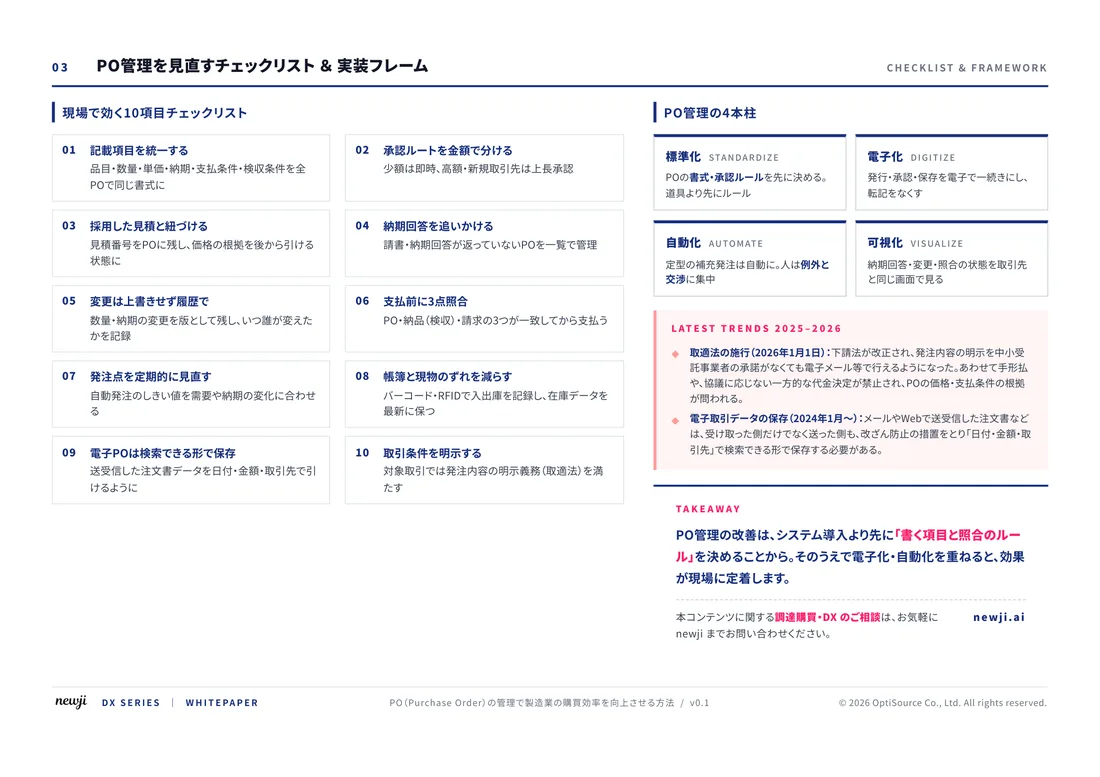
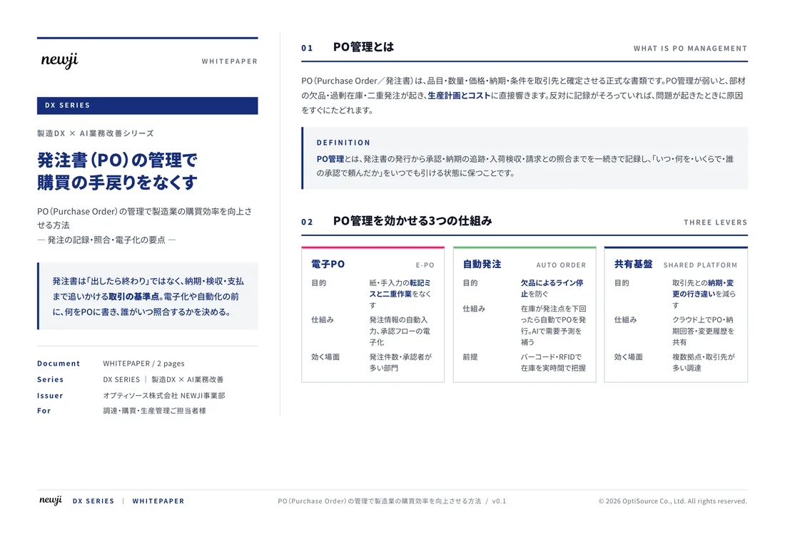
製造業の現場で使える実務資料(PDF)を無料でお届けします。"こんな資料が届きます" ↓ 下のボタンからどうぞ。
FREE DOCUMENT — サービス資料(PDF・無料)
製造業の見積・受発注クラウド
「Newji one」とは
Newji one は、製造業の調達・受発注に特化したクラウド/AIエージェント。見積依頼・発注書作成・進捗管理・承認をひとつの画面に集約し、AIが比較と異常検知を担当。最後の「GO」だけ人が押す仕組みです。
▶ 製造業の見積・受発注クラウド「Newji one」を、資料で見る(PDF・無料)
- 見積〜発注〜納期を一元管理。催促・転記のムダをゼロに
- AIが相見積もり比較と異常検知。あなたは判断だけに集中
- 取引先は「招待」で完全無料。自社コストだけで取引先ごとデジタル化
※ 取引先から招待された企業様は完全無料でご利用いただけます

 NEWJI総研
 OEM/ODM 生産委託
 AI/DX支援
 見積・発注クラウド Newji one
受発注が増えるほど、入力・確認・催促が重くなる。
受発注管理を“仕組み化“して、ミスと工数を削減しませんか。
見積・発注・納期まで一元管理できます。