

- お役立ち記事
- Data visualization technology and its practical know-how for high-dimensional/time-series data analysis

その単価は妥当か。
AI が根拠付きで分析。
相見積の比較も発注も進捗管理も、ひとつの画面に。

Data visualization technology and its practical know-how for high-dimensional/time-series data analysis

目次
Introduction to Data Visualization Technology
Data visualization is a powerful tool that transforms complex data sets into visual formats like charts, graphs, and maps, allowing users to grasp insights quickly and effectively.
For both high-dimensional and time-series data analysis, data visualization helps in interpreting vast amounts of information by highlighting trends, outliers, and patterns that might go unnoticed in a spreadsheet or database.
Understanding and implementing data visualization technology is crucial in any data-driven field as it bridges the gap between raw data and actionable insights.
High-Dimensional Data Visualization
Understanding High-Dimensional Data
High-dimensional data refers to datasets with a large number of features or variables.
These data sets are often challenging to handle because it’s hard to visualize or interpret them in traditional 2D or 3D space.
Common sources include genomics, climate data, and social media analytics.
Visualization Techniques for High-Dimensional Data
To tackle the complexity of high-dimensional data, several visualization techniques have been developed:
Parallel Coordinates
Parallel coordinates plots are used to visualize multi-dimensional data.
In these plots, each axis represents a dimension, and data points are represented as lines that intersect these axes.
This method helps in identifying groups of similar data points and outliers.
Dimensionality Reduction
Techniques like Principal Component Analysis (PCA) and t-Distributed Stochastic Neighbor Embedding (t-SNE) reduce the number of dimensions, making it easier to visualize data.
PCA transforms the data into a new set of orthogonal variables, while t-SNE focuses on preserving local proximity in data.
Heatmaps
Heatmaps use colors to represent data values in a matrix format.
They are particularly useful for visualizing correlation matrices or highlighting relationships between different variables.
Time-Series Data Visualization
Understanding Time-Series Data
Time-series data is a sequence of data points collected or recorded at specific time intervals.
Common examples include stock prices, temperature readings, and website traffic statistics.
Analyzing time-series data is essential for predicting future trends and making informed decisions based on historical data.
Visualization Techniques for Time-Series Data
There are several effective visualization techniques for analyzing time-series data:
Line Charts
Line charts are the most common way to visualize time-series data.
They plot data points along a timeline, making it easy to identify trends, patterns, and seasonal effects.
Multiple time-series can be plotted on a single chart to compare different datasets.
Bar Charts
Although typically used for categorical data, bar charts can also be employed for time-series data to compare data across distinct time intervals.
They are especially helpful when the goal is to emphasize changes over specific periods.
Area Charts
Area charts are similar to line charts but with the space beneath each line filled with colors.
This approach is useful for displaying cumulative data or highlighting the magnitude of change over time.
Seasonal and Trend Decomposition
Techniques like Seasonal Decomposition of Time Series (STL) help in breaking down a time series into trend, seasonal, and residual components.
Visualizing these components separately can provide deeper insights into the underlying structure of the data.
Practical Know-How for Effective Data Visualization
Know Your Audience
Understanding who will use the data visualization is crucial.
Each audience may have different levels of expertise or interest, so tailor the visualization accordingly to make it accessible and informative.
Choose the Right Visualization Technique
Select the visualization technique that best suits the nature of your data and the message you want to convey.
Complex visualizations aren’t always necessary; sometimes simplicity delivers the clearest message.
Focus on Clarity and Simplicity
Avoid overloading the visual representation with excessive data points or clutter.
Clear labels, legends, and a focused narrative will improve understanding and engagement.
Use Color Wisely
Color can enhance understanding or distract the viewer if used improperly.
Choose colors that emphasize key information, and ensure that your visualizations are color-blind friendly.
Test and Iterate
Effective data visualization often requires testing various approaches.
Seek feedback from peers and iterate to refine the presentation for maximum clarity and impact.
Conclusion
Data visualization technology is a vital component of high-dimensional and time-series data analysis.
By employing appropriate visualization techniques, you can unlock valuable insights and communicate findings compellingly.
Mastering the art of data visualization requires understanding your data, your audience, and the nuances of various visualization tools and techniques.
Implementing best practices in data visualization will enhance your ability to make data-driven decisions and present information in a way that is both visually appealing and easily comprehensible.
この記事の理解を深める
無料ホワイトペーパーをプレゼント
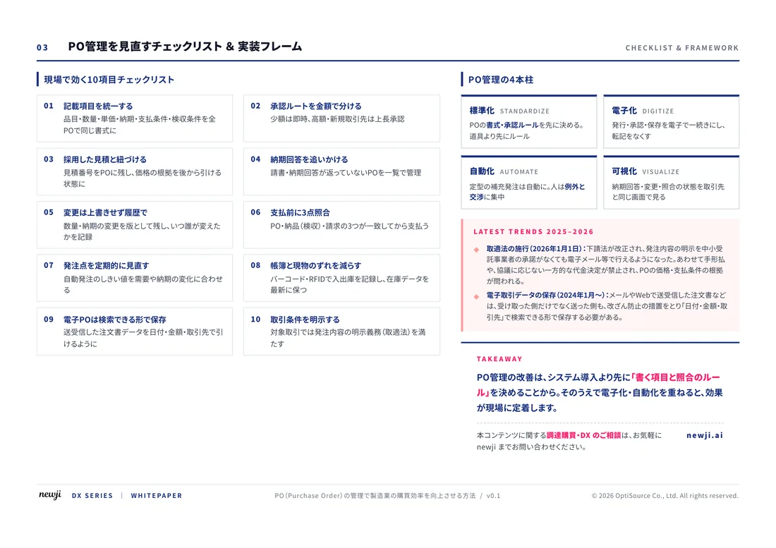
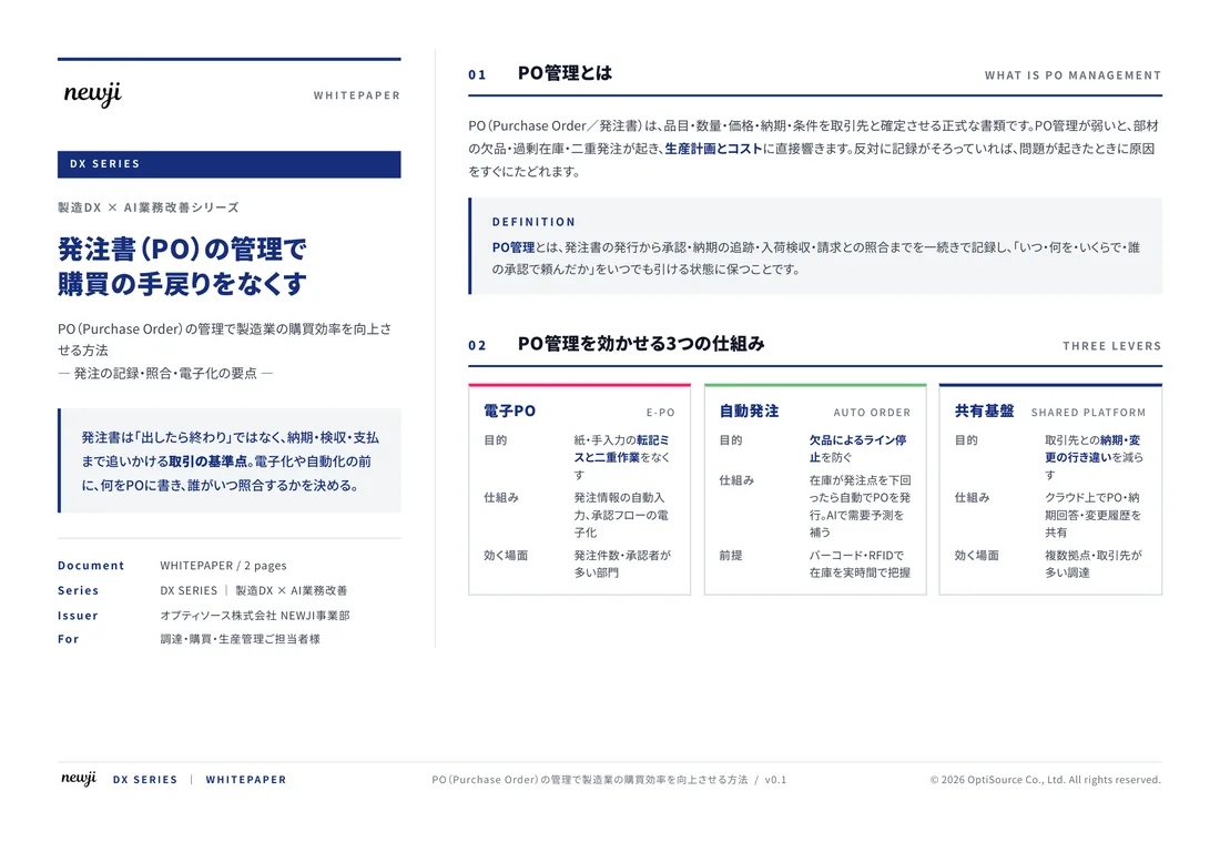
製造業の現場で使える実務資料(PDF)を無料でお届けします。"こんな資料が届きます" ↓ 下のボタンからどうぞ。
FREE DOCUMENT — サービス資料(PDF・無料)
製造業の見積・受発注クラウド
「Newji one」とは
Newji one は、製造業の調達・受発注に特化したクラウド/AIエージェント。見積依頼・発注書作成・進捗管理・承認をひとつの画面に集約し、AIが比較と異常検知を担当。最後の「GO」だけ人が押す仕組みです。
▶ 製造業の見積・受発注クラウド「Newji one」を、資料で見る(PDF・無料)
- 見積〜発注〜納期を一元管理。催促・転記のムダをゼロに
- AIが相見積もり比較と異常検知。あなたは判断だけに集中
- 取引先は「招待」で完全無料。自社コストだけで取引先ごとデジタル化
※ 取引先から招待された企業様は完全無料でご利用いただけます

 NEWJI総研
 OEM/ODM 生産委託
 AI/DX支援
 見積・発注クラウド Newji one
受発注が増えるほど、入力・確認・催促が重くなる。
受発注管理を“仕組み化“して、ミスと工数を削減しませんか。
見積・発注・納期まで一元管理できます。