

- お役立ち記事
- Examples of using visualization/quantification of sensitivity and data analysis

その単価は妥当か。
AI が根拠付きで分析。
相見積の比較も発注も進捗管理も、ひとつの画面に。

Examples of using visualization/quantification of sensitivity and data analysis

目次
Understanding Sensitivity Analysis
Sensitivity analysis is a powerful tool used in various fields to determine how different variables impact a given outcome or decision.
This method quantifies the effect of changing input variables on an output of interest, thereby helping stakeholders make informed decisions.
By visualizing and quantifying this sensitivity, businesses and researchers can better understand the relationships within their data and predict how changes might affect results.
The Importance of Sensitivity Analysis
Conducting sensitivity analysis is significant because it exposes the uncertainties in data sets or models, highlighting which variables have the most influence over the outcomes.
This is crucial in fields such as finance, engineering, environmental science, and healthcare, where decision-making can be significantly impacted by uncertain or variable data inputs.
Additionally, sensitivity analysis helps identify variables that require more precise data collection, ensuring improvements in the accuracy and reliability of predictions or models.
Visualizing Sensitivity Analysis
Visual tools play a key role in interpreting the results of sensitivity analysis.
Graphs and charts can illustrate how changes in input variables will influence the output, making it easier for stakeholders to grasp complex data interactions.
Common Visualization Techniques
Several visualization techniques are commonly used in sensitivity analysis to display data effectively.
These include:
– **Tornado Diagrams**: These diagrams provide a graphical representation of the sensitivity of an outcome to various factors.
Variables are depicted as bars, and the length of each bar indicates its relative impact on the result, resembling the shape of a tornado.
– **Spider Plots**: These plots graphically demonstrate how changes in input variables lead to changes in output variables.
Each line on a spider plot represents a different variable, intersecting at a single origin point, creating a web-like appearance.
– **Scatter Plots**: These are effective in showing the relationship between two variables and can be used in sensitivity analysis to identify correlations.
A scatter plot displays data points on a two-dimensional axis, revealing trends or relationships.
Quantification in Data Analysis
Quantifying sensitivity involves assigning numerical values to the effect of changes in variables, enabling a more precise understanding of data interactions.
Methods for Quantifying Sensitivity
Two popular methods for quantifying sensitivity are:
– **Sensitivity Coefficients**: These represent the ratio of changes in the output to changes in inputs.
By calculating sensitivity coefficients, analysts can quantify how much a change in an input variable will impact the output.
– **Partial Derivatives**: In mathematical modeling, the partial derivative method quantifies sensitivity by computing the rate of change of the outcome concerning specific variables.
This approach is often used when the relationship between input and output is expressed as a mathematical function.
Applications of Sensitivity and Data Analysis
Implementing sensitivity analysis has practical applications across diverse industries.
Wind Farm Design
In renewable energy, sensitivity analysis determines factors affecting a wind farm’s power output.
By analyzing variables such as wind speed, turbine placement, and rotor size, engineers can optimize design for maximum efficiency and minimal environmental impact.
Financial Forecasting
In finance, sensitivity analysis helps assess how changes in market factors like interest rates and stock prices affect investment portfolios.
It enables financial planners to minimize risk by adjusting strategies based on potential market scenarios.
Healthcare Decision Making
Healthcare professionals use sensitivity analysis to evaluate treatment options and resource allocation.
It aids in understanding how variable changes, such as patient demographics or treatment costs, influence healthcare outcomes.
Implementing Effective Sensitivity and Data Analysis
When implementing sensitivity analysis, it is essential to follow a structured approach to ensure credible outcomes.
Defining Objectives
Clearly define the purpose of the analysis and the specific decisions or outcomes it will influence.
This step helps maintain focus and guides subsequent data collection and analysis efforts.
Data Collection and Preparation
Accurate and comprehensive data is a cornerstone of effective sensitivity analysis.
Ensure the data is clean, well-organized, and relevant to the variables under study.
Data preparation involves filtering, normalization, and transformation to make it suitable for analysis.
Selecting the Appropriate Model
Choose a model that accurately represents the relationships between input and output variables.
This could range from simple linear models to complex simulations or machine learning algorithms, depending on the problem’s complexity.
Interpreting Results
Once the analysis is complete, visualize and interpret the results to derive actionable insights.
Make use of graphical representations such as charts and diagrams to communicate findings to stakeholders effectively.
This step involves determining which variables are most influential and what potential actions can be taken based on these insights.
Conclusion
Sensitivity analysis is a vital component of modern data analysis, enabling better decision-making by understanding the potential effects of varying input conditions.
By visualizing and quantifying sensitivity, organizations and researchers can gain a deeper comprehension of their data, allowing for optimized decisions and improved results in their respective fields.
Whether in energy, finance, healthcare, or any other sector, the insights gained from sensitivity analysis are invaluable for steering strategic initiatives to success.
この記事の理解を深める
無料ホワイトペーパーをプレゼント
製造業の現場で使える実務資料(PDF)を無料でお届けします。"こんな資料が届きます" ↓ 下のボタンからどうぞ。
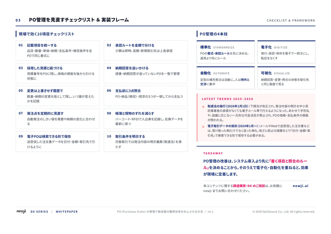
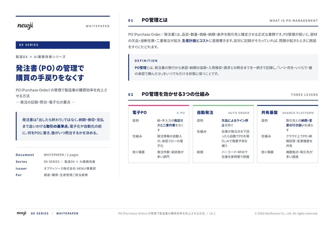
FREE DOCUMENT — サービス資料(PDF・無料)
製造業の見積・受発注クラウド
「Newji one」とは
Newji one は、製造業の調達・受発注に特化したクラウド/AIエージェント。見積依頼・発注書作成・進捗管理・承認をひとつの画面に集約し、AIが比較と異常検知を担当。最後の「GO」だけ人が押す仕組みです。
▶ 製造業の見積・受発注クラウド「Newji one」を、資料で見る(PDF・無料)
- 見積〜発注〜納期を一元管理。催促・転記のムダをゼロに
- AIが相見積もり比較と異常検知。あなたは判断だけに集中
- 取引先は「招待」で完全無料。自社コストだけで取引先ごとデジタル化
※ 取引先から招待された企業様は完全無料でご利用いただけます

 NEWJI総研
 OEM/ODM 生産委託
 AI/DX支援
 見積・発注クラウド Newji one
受発注が増えるほど、入力・確認・催促が重くなる。
受発注管理を“仕組み化“して、ミスと工数を削減しませんか。
見積・発注・納期まで一元管理できます。