

- お役立ち記事
- How to create a quality chart

その単価は妥当か。
AI が根拠付きで分析。
相見積の比較も発注も進捗管理も、ひとつの画面に。

How to create a quality chart

目次
Understanding What a Quality Chart Is
Quality charts, also known as control charts, are essential tools used to monitor, control, and improve the quality of processes in various industries.
These charts provide a visual representation of data over time, helping to identify trends, patterns, and variations that may occur.
By identifying these elements, organizations can implement corrective actions that ensure the process remains stable and produces quality outcomes.
The Importance of Quality Charts
Quality charts play a key role in maintaining consistency in products and services.
They help businesses understand whether a process is in control or if there’s a need for adjustments.
With quality charts, organizations can avoid wasted resources and ensure customer satisfaction by maintaining a high standard of quality.
They also enable businesses to make data-driven decisions, which can lead to increased profitability and enhanced reputation.
Steps to Create a Quality Chart
The process of creating a quality chart involves several important steps.
Following these steps will help ensure the chart’s effectiveness in maintaining quality control.
1. Determine the Process to Be Monitored
The first step is to identify the specific process that needs monitoring.
Choose a process that significantly impacts the quality of your product or service.
Consider processes that have shown inconsistencies in the past or are critical to your operations.
2. Collect Data
Once you’ve identified the process, collect data that accurately represents its performance over time.
Depending on the process, data can be collected hourly, daily, weekly, or at any other relevant interval.
Ensure that the data collected is reliable and consistent to provide an accurate analysis.
3. Select the Type of Quality Chart
There are various types of quality charts, such as control charts for variables and control charts for attributes.
The type of chart you choose depends on the nature of the data collected.
For variables, which are measured on a continuous scale, X-bar and R charts are commonly used.
On the other hand, for attributes data, which are counted and not measured, p-charts and c-charts are appropriate.
4. Plot the Data
With the data collected, begin plotting it on the selected quality chart.
This involves marking data points on the chart at the corresponding time intervals.
Make sure to include upper and lower control limits, which are calculated based on the data, to identify the range of acceptable variations.
5. Analyze the Chart
After plotting the data, analyze the quality chart to identify any trends or patterns that may exist.
Look for unusual patterns or points lying outside the control limits, as these may indicate issues in the process.
The analysis should help you understand process stability and variation, allowing you to detect any deviation from the expected performance.
6. Implement Corrective Actions
If the analysis reveals any issues or inconsistencies in the process, implement corrective actions to address these problems.
Identify the root cause of variations and take steps to eliminate them.
Ensure the actions taken contribute to bringing the process back within acceptable control limits.
Common Pitfalls to Avoid
When creating a quality chart, it’s important to avoid certain common mistakes that can compromise its effectiveness.
Firstly, ensure data is collected consistently and accurately to prevent misleading results.
Avoid overreacting to natural fluctuations within control limits, as unnecessary adjustments can lead to further instability.
Instead, focus on addressing significant variations that affect process quality.
Additionally, regularly review and update control limits as process improvements occur.
Ignoring these updates can result in outdated charts that fail to provide useful insights.
Benefits of Implementing Quality Charts
Implementing quality charts offers numerous benefits for organizations aiming to improve their processes.
They provide a visual representation of process performance, making it easier to understand and communicate to all stakeholders.
Quality charts also improve decision-making by highlighting areas that need attention and enabling proactive management of processes.
Moreover, regular monitoring through quality charts fosters a culture of continuous improvement, where the focus is on enhancing quality and efficiency.
Conclusion
Creating a quality chart is an invaluable process for any organization striving for excellence in quality management.
By following the steps outlined above and avoiding common pitfalls, you can effectively monitor and improve your processes.
Consistent use of quality charts empowers businesses to maintain high standards, increase customer satisfaction, and ultimately achieve greater success.
この記事の理解を深める
無料ホワイトペーパーをプレゼント
製造業の現場で使える実務資料(PDF)を無料でお届けします。"こんな資料が届きます" ↓ 下のボタンからどうぞ。
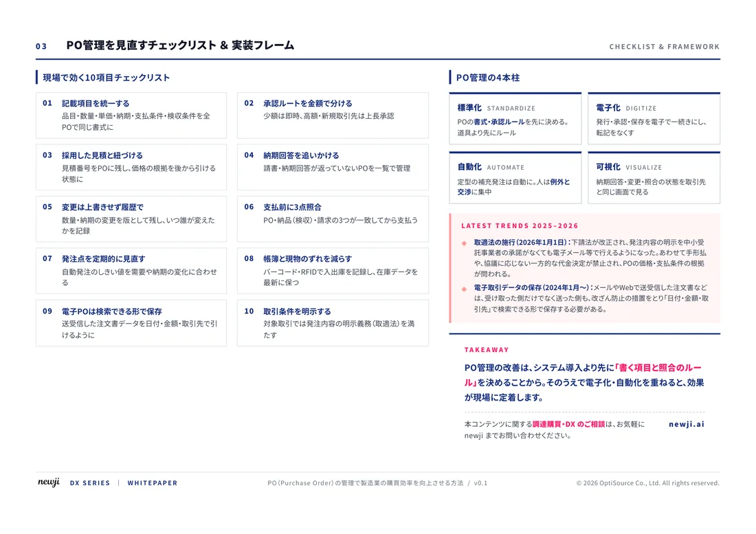
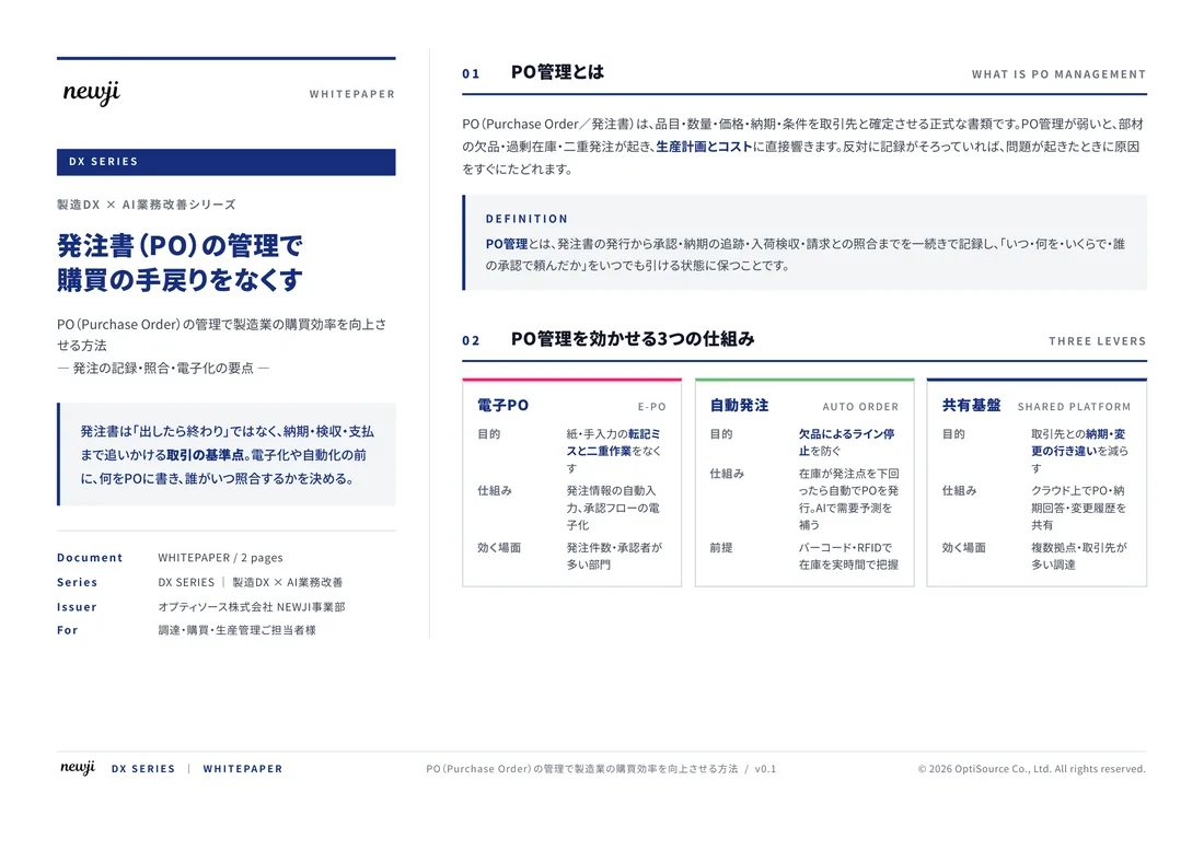
FREE DOCUMENT — サービス資料(PDF・無料)
製造業の見積・受発注クラウド
「Newji one」とは
Newji one は、製造業の調達・受発注に特化したクラウド/AIエージェント。見積依頼・発注書作成・進捗管理・承認をひとつの画面に集約し、AIが比較と異常検知を担当。最後の「GO」だけ人が押す仕組みです。
▶ 製造業の見積・受発注クラウド「Newji one」を、資料で見る(PDF・無料)
- 見積〜発注〜納期を一元管理。催促・転記のムダをゼロに
- AIが相見積もり比較と異常検知。あなたは判断だけに集中
- 取引先は「招待」で完全無料。自社コストだけで取引先ごとデジタル化
※ 取引先から招待された企業様は完全無料でご利用いただけます

 NEWJI総研
 OEM/ODM 生産委託
 AI/DX支援
 見積・発注クラウド Newji one
受発注が増えるほど、入力・確認・催促が重くなる。
受発注管理を“仕組み化“して、ミスと工数を削減しませんか。
見積・発注・納期まで一元管理できます。