

- お役立ち記事
- The key to UI design is to register test results using only pass/fail buttons

その単価は妥当か。
AI が根拠付きで分析。
相見積の比較も発注も進捗管理も、ひとつの画面に。

The key to UI design is to register test results using only pass/fail buttons

目次
Understanding UI Design
User Interface (UI) design is a critical aspect of any digital product, whether it be a mobile app, a web application, or software.
The primary goal of UI design is to create an intuitive and enjoyable experience for users.
This often involves creating simple, clear, and efficient pathways for users to achieve their goals with minimal effort.
A well-designed UI can make complex processes feel seamless and empower users to explore more of your application’s functionalities.
The Role of Simplicity in UI Design
Simplicity is fundamental in UI design.
A straightforward design focuses on clear visuals and concise language, helping users navigate and interact with the interface effortlessly.
When users encounter a cluttered UI, they can quickly become overwhelmed or frustrated, which may lead them to abandon the product altogether.
Therefore, reducing unnecessary elements and focusing on the core actions users need to perform can greatly enhance the user experience.
Using Pass/Fail Buttons for Test Results
In certain applications, especially those involving assessment or testing, registering results can be cumbersome.
Traditionally, multiple inputs might be required to log every single result, whether it be correct, incorrect, or partial credit.
However, adopting a system using only pass/fail buttons can greatly simplify this process.
Benefits of Pass/Fail Buttons
Implementing pass/fail buttons offers a host of benefits for both users and developers.
Firstly, these buttons provide a clear and straightforward method to record outcomes, drastically minimizing the chance of user error.
By avoiding complex menus or several input fields, the risk of misentry is reduced, which in turn can improve data accuracy.
Moreover, the simplicity of pass/fail buttons speeds up the data-entry process.
For instances where quick documentation is necessary, this system allows users to complete their tasks in less time, ensuring a more efficient workflow.
These efficiencies can lead to higher satisfaction and increased productivity among users.
Enhancing Usability
To maximize the effectiveness of pass/fail buttons, consider a few key usability enhancements.
Firstly, ensure that buttons are distinctly colored and labeled to prevent any confusion.
Using universally recognized symbols, like a checkmark for pass and an ‘X’ for fail, can further clarify their functions.
It’s also paramount that these buttons are easily accessible and appropriately sized.
They should be large enough to be tapped comfortably on touchscreens, but not so large that they overwhelm the interface.
Spacing between buttons should be adequate to avoid accidental selection, particularly on devices used in motion or under hurried conditions.
Design Considerations
When integrating pass/fail buttons into a UI design, there are crucial elements to consider.
First, evaluate the placement of these buttons.
They need to be situated where users naturally look when they intend to register a result.
This placement should not require users to scroll or switch views, which can disrupt the workflow.
Additionally, it’s beneficial to incorporate an undo feature, allowing mistakes to be easily rectified without hassle.
This function can reassure users and encourage them to proceed with confidence, knowing they can correct any mispress without difficulty.
Another consideration is scalability.
If there’s a potential for the assessment system to evolve or to accommodate more diverse data points in the future, design the UI so as to integrate these additions seamlessly.
Feedback Mechanisms
To give users assurance that their actions are being correctly recorded, incorporate immediate visual or auditory feedback when pass/fail buttons are pressed.
This confirmation should be subtle yet noticeable, such as a brief change in button color, or a soft sound affirming the selection.
Feedback mechanisms help strengthen user trust in the interface, offering transparency and reinforcing the feeling of a responsive, interactive environment.
Real-World Applications
The use of pass/fail buttons can be especially advantageous in educational settings, where assessments often require quick, straightforward entries.
Teachers grading assignments can benefit from an efficient system that simplifies scoring and makes reporting and tracking results significantly easier.
Additionally, in quality control processes within manufacturing or service industries, pass/fail buttons can streamline the workflow, allowing inspectors or evaluators to log findings efficiently.
Finally, preliminary medical assessments or diagnosis systems can employ these simple interactions to capture initial patient data swiftly, particularly in fast-paced settings such as triage or emergency care.
Conclusion
Focusing on simplicity in UI design can radically improve user experiences.
By leveraging pass/fail buttons for registering test results, designers and developers can enhance the utility and clarity of their products.
Ultimately, a UI that embraces ease of use encourages users to engage more fully with an application, potentially increasing both user satisfaction and engagement.
In a world where digital interfaces are omnipresent, prioritizing the user experience through thoughtful design will continue to be a decisive factor in the success of a product.
この記事の理解を深める
無料ホワイトペーパーをプレゼント
製造業の現場で使える実務資料(PDF)を無料でお届けします。"こんな資料が届きます" ↓ 下のボタンからどうぞ。
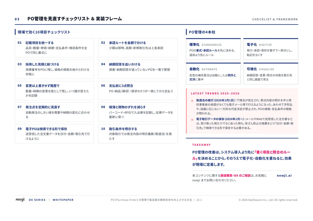
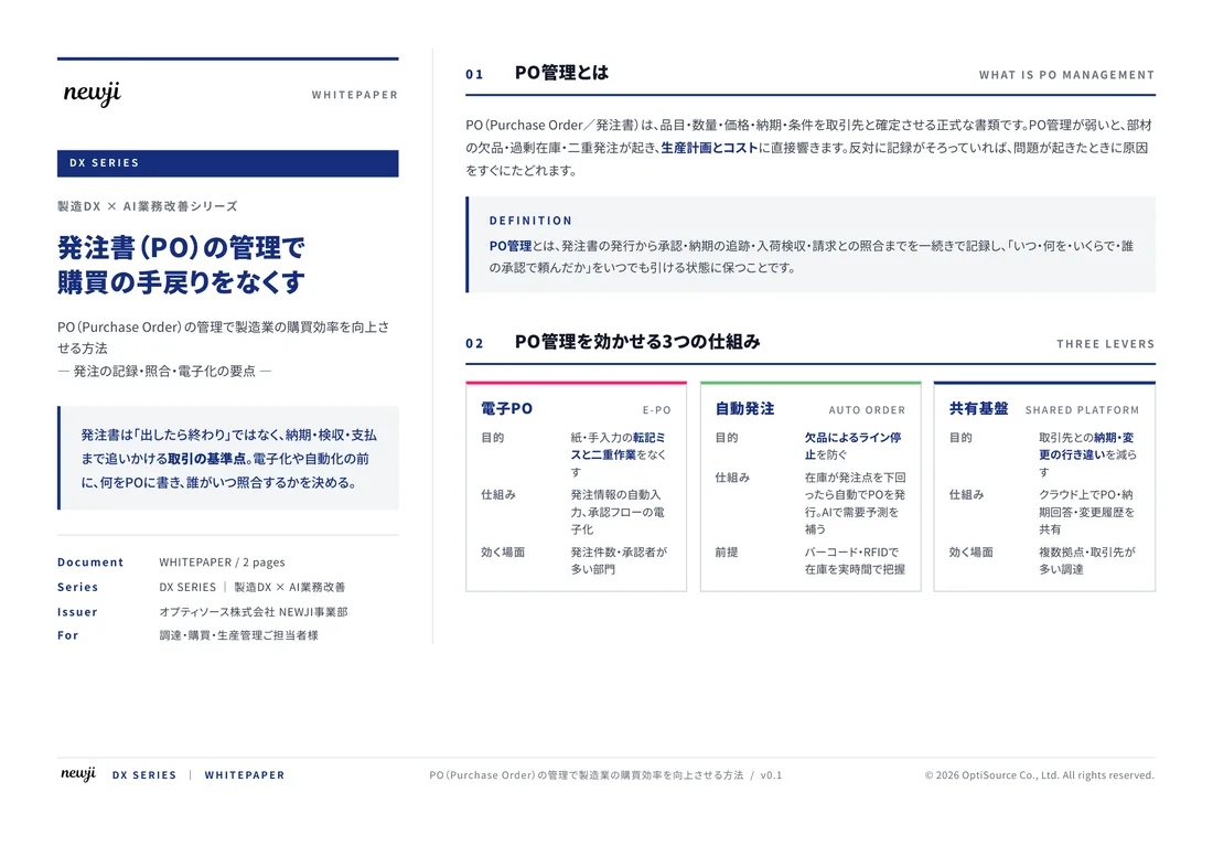
FREE DOCUMENT — サービス資料(PDF・無料)
製造業の見積・受発注クラウド
「Newji one」とは
Newji one は、製造業の調達・受発注に特化したクラウド/AIエージェント。見積依頼・発注書作成・進捗管理・承認をひとつの画面に集約し、AIが比較と異常検知を担当。最後の「GO」だけ人が押す仕組みです。
▶ 製造業の見積・受発注クラウド「Newji one」を、資料で見る(PDF・無料)
- 見積〜発注〜納期を一元管理。催促・転記のムダをゼロに
- AIが相見積もり比較と異常検知。あなたは判断だけに集中
- 取引先は「招待」で完全無料。自社コストだけで取引先ごとデジタル化
※ 取引先から招待された企業様は完全無料でご利用いただけます

 NEWJI総研
 OEM/ODM 生産委託
 AI/DX支援
 見積・発注クラウド Newji one
受発注が増えるほど、入力・確認・催促が重くなる。
受発注管理を“仕組み化“して、ミスと工数を削減しませんか。
見積・発注・納期まで一元管理できます。