

- お役立ち記事
- Visualizing data can actually highlight hidden defects on-site

その単価は妥当か。
AI が根拠付きで分析。
相見積の比較も発注も進捗管理も、ひとつの画面に。

Visualizing data can actually highlight hidden defects on-site

Visualizing data has become an essential tool in various industries to improve decision-making, enhance performance, and uncover hidden patterns.
One of its fascinating applications is its ability to highlight hidden defects on-site.
Whether it’s manufacturing, construction, or any sector involving complex processes, visualizing data can be the key to unlocking insights that are not easily visible through traditional methods.
目次
What is Data Visualization?
Data visualization is the representation of information and data in a graphical format.
It enables decision-makers to see analytics in a way that is accessible and easy to comprehend.
By using visual elements like charts, graphs, and maps, data visualization tools provide an interactive way to get insights from data.
The goal is to make complex data more understandable and usable.
It allows us to observe trends, detect patterns, and notice outliers.
Visualizing data makes it easier to locate and resolve issues that might be hidden in raw data.
Importance of Detecting Hidden Defects
Hidden defects can be a major source of inefficiency and cost.
These are issues that do not get detected until they cause significant problems, such as product recalls, project delays, or increased maintenance costs.
Detecting these hidden defects early can prevent costly mistakes and improve overall productivity.
Traditional methods of identifying defects often rely on occasional audits or inspections.
However, these methods might not catch everything.
Manual inspections are prone to human error and can miss subtle issues that accumulate over time.
This is where data visualization comes in, offering a new perspective for identifying and solving problems.
How Data Visualization Helps Spot Hidden Defects
Enhanced Pattern Recognition
Data visualization allows us to notice otherwise hidden patterns quickly.
For instance, if a defect appears on a specific day of the week or within certain environmental conditions, patterns may emerge when visualized over time.
Graphs can display these events, highlighting periods or areas of concern where defects occur more frequently.
Interactive Data Exploration
Interactive data visualizations enable users to explore different scenarios by varying the variables they’re interested in.
Users can drill down into specific details that might contribute to potential defects.
Imagine a scenario where a factory uses sensors to collect real-time data about machine operations.
Interactive dashboards can visualize this data, helping users to identify anomalies and pinpoint their causes.
Correlation Identification
Data visualization also helps in understanding correlations between different variables.
For example, correlating production line data with temperature and humidity variations may uncover a defect pattern linked to certain climates.
Understanding these relationships can aid in anticipating and preventing defects.
Predictive Analytics
When paired with predictive analytics, data visualization isn’t just about identifying current defects; it’s also about predicting future ones.
Predictive models can be visualized to show probability outcomes of defects under certain conditions or maintenance schedules.
This foresight aids in creating more robust preventive measures, enhancing on-site processes, and reducing downtime.
Tools and Techniques for Data Visualization
Several tools and technologies are specifically designed to aid with data visualization.
Let’s explore some of the popular ones used across industries:
Tableau
Tableau is a powerful tool for creating interactive and shareable dashboards.
It allows businesses to visualize their data in depth and provides deep insights through its user-friendly interface.
With its ability to connect to virtually any data source, it provides both live and in-memory data support.
Power BI
Microsoft’s Power BI is another robust business analytics tool.
It transforms data into comprehensive visuals that users can quickly access and understand.
Power BI offers detailed dashboards, reports, and accessible analytics capabilities to prevent on-site defects.
Google Data Studio
Google Data Studio is a free tool that turns your data into informative dashboards and reports.
With seamless integration to other Google services and multiple data sources, it simplifies data visualization and enhances defect detection processes.
D3.js
D3.js is a JavaScript library for producing dynamic, interactive data visualizations in web browsers.
It allows developers to bind arbitrary data to a Document Object Model (DOM) and apply data-driven transformations.
Though it requires some coding knowledge, it’s ideal for creating custom visualizations.
Implementing Data Visualization On-Site
Successful implementation of data visualization requires a strategy focused on the specific needs of the site.
Firstly, ensure there is a clear understanding of what data is available and what is required.
Identify key metrics that are critical for spotting defects.
Collaboration between data analysts, site managers, and IT experts is crucial.
They need to tailor dashboards and reports to the unique environments of their operations.
Regular review and adaptation of visualization dashboards ensure they continually meet evolving on-site needs.
Conclusion
The power of data visualization lies in its ability to reveal hidden defects and guide corrective actions.
By translating complex datasets into visual formats, organizations can significantly enhance their defect detection capabilities.
This, in turn, leads to improved efficiency, cost savings, and product quality.
Embedding data visualization into everyday on-site activities not only alerts organizations to current issues but also provides insights into future risks.
With the ongoing advancement of visualization technologies, the potential to leverage data for enhanced decision-making continues to grow.
この記事の理解を深める
無料ホワイトペーパーをプレゼント
製造業の現場で使える実務資料(PDF)を無料でお届けします。"こんな資料が届きます" ↓ 下のボタンからどうぞ。
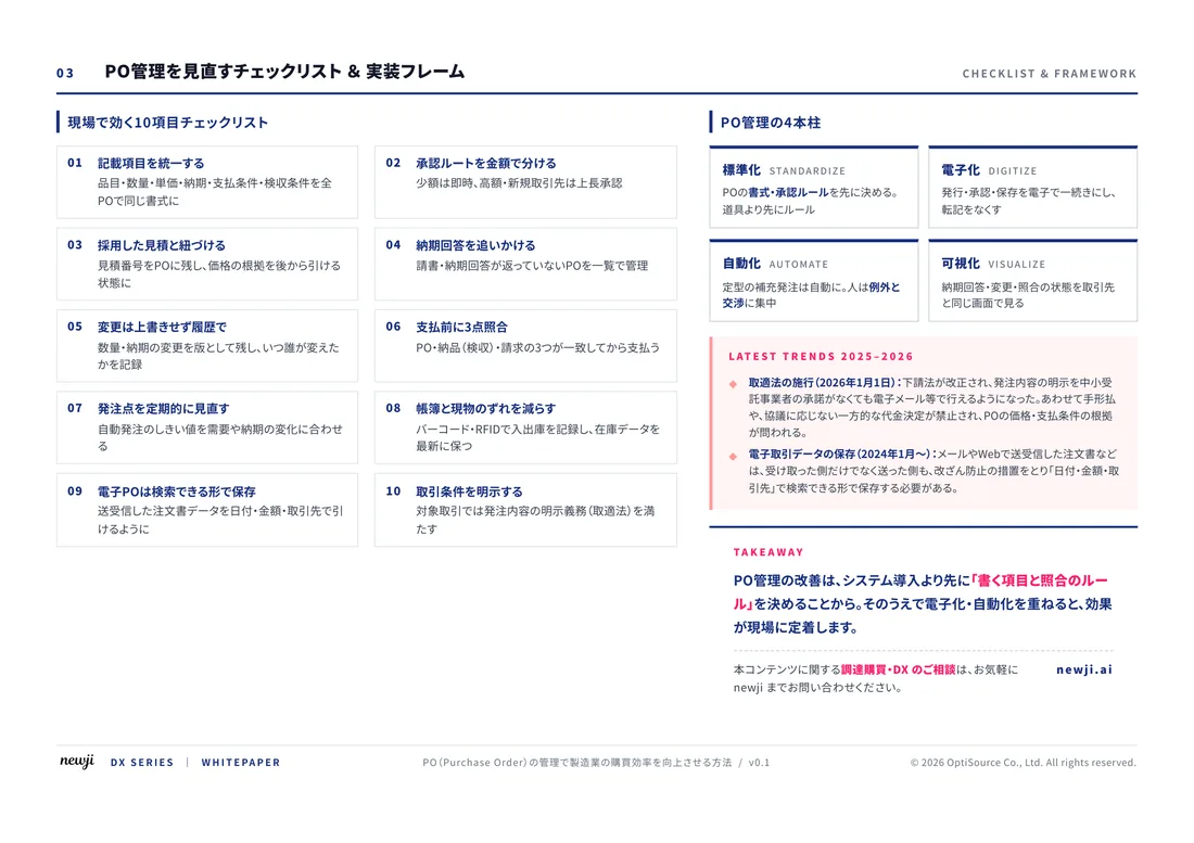
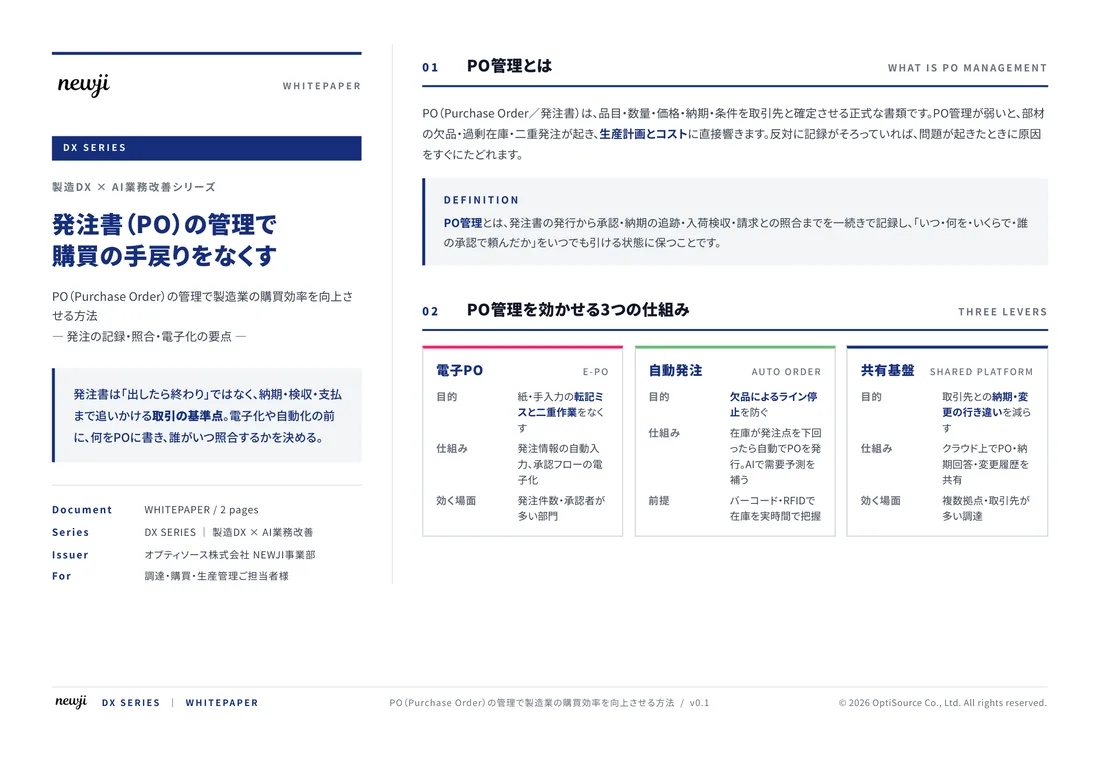
FREE DOCUMENT — サービス資料(PDF・無料)
製造業の見積・受発注クラウド
「Newji one」とは
Newji one は、製造業の調達・受発注に特化したクラウド/AIエージェント。見積依頼・発注書作成・進捗管理・承認をひとつの画面に集約し、AIが比較と異常検知を担当。最後の「GO」だけ人が押す仕組みです。
▶ 製造業の見積・受発注クラウド「Newji one」を、資料で見る(PDF・無料)
- 見積〜発注〜納期を一元管理。催促・転記のムダをゼロに
- AIが相見積もり比較と異常検知。あなたは判断だけに集中
- 取引先は「招待」で完全無料。自社コストだけで取引先ごとデジタル化
※ 取引先から招待された企業様は完全無料でご利用いただけます

 NEWJI総研
 OEM/ODM 生産委託
 AI/DX支援
 見積・発注クラウド Newji one
受発注が増えるほど、入力・確認・催促が重くなる。
受発注管理を“仕組み化“して、ミスと工数を削減しませんか。
見積・発注・納期まで一元管理できます。