
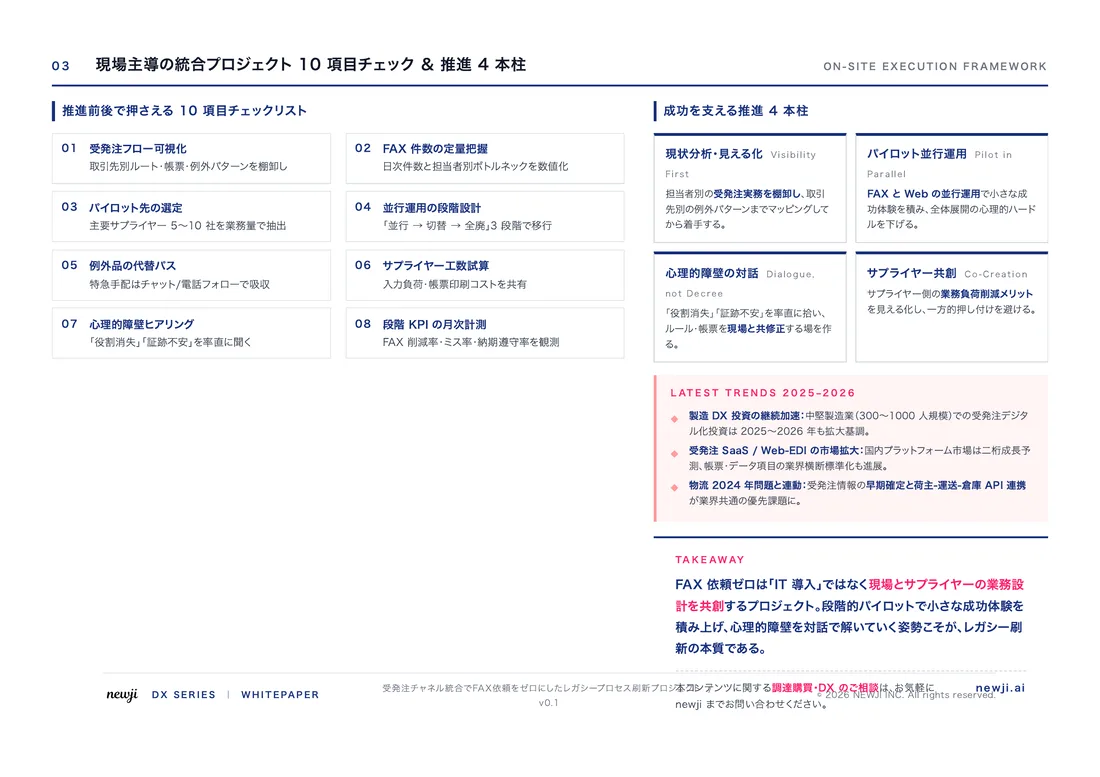
- お役立ち記事
- How to use diagrams effectively and how to use them to explain proposals
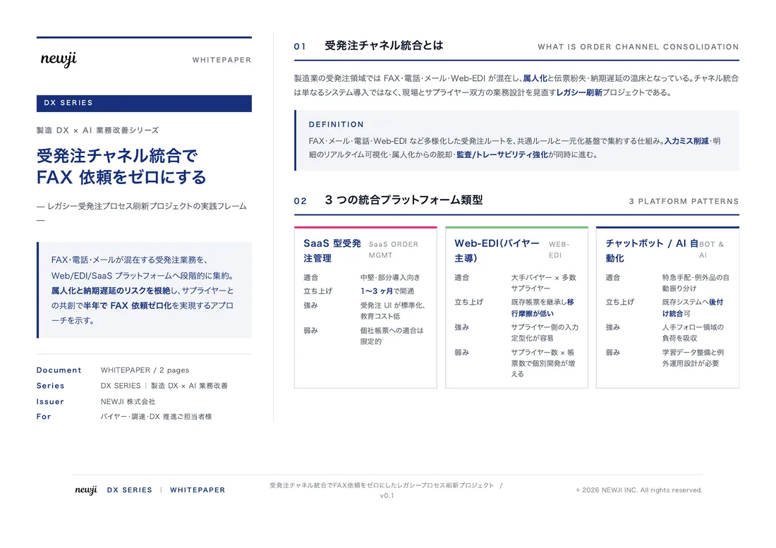
スタートアップから大手まで。
調達・受発注をAIで標準化。
相見積比較も進捗管理もAIが下支え。取引先は招待で完全無料。

How to use diagrams effectively and how to use them to explain proposals

目次
Understanding Diagrams
When it comes to presenting ideas and proposals, having clear and effective communication is essential.
One of the most powerful tools to achieve this is using diagrams.
Diagrams can turn complex information into something that is easily understandable and engaging.
By breaking down abstract ideas into visual elements, diagrams help bridge the gap between complex data and clear comprehension.
Why Use Diagrams?
Diagrams are invaluable for several reasons.
Firstly, they provide a visual representation of information, which can make data more accessible and engaging.
Visual aids can help maintain the audience’s attention and can make a presentation more appealing.
Secondly, diagrams simplify complex information, allowing for easier digestion of the material.
They can reduce cognitive load by providing an overview of the subject matter at a glance.
Another key reason for using diagrams is their ability to enhance memory retention.
People tend to remember information better when it is presented visually.
Furthermore, diagrams can also facilitate better discussion and feedback as they often highlight relationships and patterns that might not be immediately apparent in text.
Types of Diagrams
When choosing the right diagram, it is important to consider the specific needs of your presentation.
Here are a few common types of diagrams and their uses:
Flowcharts
Flowcharts are used to represent processes or workflows.
They help in showing the sequence of steps or decisions required to achieve a particular outcome.
Flowcharts are particularly useful in presenting how a system functions or elucidating a process in a clear, sequential manner.
Mind Maps
Mind maps are ideal for brainstorming and organizing ideas.
They start with a central concept and branch out to show related topics, making them helpful for visualizing relationships and hierarchies in information.
Mind maps are great for planning and organizing presentations, reports, or strategy sessions.
Pie Charts and Bar Graphs
Pie charts and bar graphs are excellent for displaying statistical data.
They allow you to present numerical data in a format that is easy to understand and analyze.
Pie charts are particularly useful for showing percentages and proportions, while bar graphs are best for comparing quantities across different categories.
Gantt Charts
Gantt charts are commonly used for project management and planning.
They help outline a project schedule and can display the timing and duration of different tasks within a project.
These charts visually represent timelines, making it easy to identify project phases and milestones.
How to Create Effective Diagrams
Creating effective diagrams involves not only selecting the right type but also considering design elements.
Here are some tips:
Keep It Simple
Avoid cluttering your diagram with too much information.
Focus on the key points you want to convey.
A simple and clean design is often more effective in delivering your message.
Use Colors Wisely
Colors can help distinguish different elements of your diagram, making it more readable.
However, be mindful to use colors that are visually appealing and accessible to those with color blindness.
Label Clearly
Ensure all components of your diagram are clearly labeled.
This helps the audience understand what each part represents.
Avoid using technical jargon unless it is necessary and your audience is familiar with it.
Maintain Consistency
Use consistent symbols, shapes, and fonts throughout your diagrams.
This helps maintain a professional look and makes it easier for your audience to interpret the information.
Using Diagrams in Proposals
When using diagrams in proposals, their strategic placement can significantly enhance your ability to persuade and inform.
Here’s how:
Align with Your Objectives
Ensure that each diagram you include aligns with the specific objectives of your proposal.
It should support the points you are trying to make and add value to your argument.
Introduce Concepts Early
Use diagrams early in your proposal to introduce complex concepts.
This helps set the stage for the details that will follow and provides a visual reference for your audience.
Clarify Details
Use diagrams to clarify detailed information.
For example, illustrating a project timeline with a Gantt chart can provide a clear picture of the project’s scope and timeline.
Reinforce Key Points
Use diagrams to highlight and reinforce key points.
For example, a bar graph can effectively summarize data points from a study or survey.
Conclusion
Diagrams are a powerful tool for making information more accessible, engaging, and memorable.
When used effectively, they can enhance communication, aid in comprehension, and improve the impact of proposals.
By understanding the different types of diagrams and incorporating them thoughtfully into your presentations and proposals, you can communicate more clearly and effectively with your audience.
この記事の理解を深める
無料ホワイトペーパーをプレゼント
製造業の現場で使える実務資料(PDF)を無料でお届けします。"こんな資料が届きます" ↓ 下のボタンからどうぞ。
PRODUCT — 製造業向け 調達・受発注クラウド
この記事の課題、
newji で解決しませんか?
newji は、製造業の調達・受発注に特化したクラウド/AIエージェント。見積依頼・発注書作成・進捗管理・承認をひとつの画面に集約し、AIが比較と異常検知を担当。最後の「GO」だけ人が押す仕組みです。
- 見積〜発注〜納期を一元管理。催促・転記のムダをゼロに
- AIが相見積もり比較と異常検知。あなたは判断だけに集中
- 取引先は「招待」で完全無料。自社コストだけで取引先ごとデジタル化
※ 取引先から招待された企業様は完全無料でご利用いただけます

