

- お役立ち記事
- Examples and Effectiveness of the Seven QC Tools in Quality Control in Manufacturing

その単価は妥当か。
AI が根拠付きで分析。
相見積の比較も発注も進捗管理も、ひとつの画面に。

Examples and Effectiveness of the Seven QC Tools in Quality Control in Manufacturing

Quality control is crucial for manufacturing. It ensures products meet standards, satisfy customers, and reduce the cost of poor quality. One of the most effective methods for maintaining high-quality standards is by using the Seven QC Tools. This article will explore each tool, provide examples, and discuss its effectiveness.
1. Cause-and-Effect Diagram
Example: Imagine a factory facing a high defect rate in its plastic bottle production line. Engineers use a cause-and-effect diagram to brainstorm and identify potential causes such as machine malfunctions, poor raw materials, and inadequate worker training. This visual aid helps them focus on the most impactful areas for improvement.
Effectiveness: The cause-and-effect diagram, also known as the fishbone diagram or Ishikawa diagram, is highly effective in identifying root causes of problems. It encourages brainstorming and organizes complex issues into manageable categories, simplifying problem-solving.
2. Check Sheet
Example: In a car manufacturing facility, a quality control inspector uses check sheets to record data on defects observed during the inspection of a day’s production. The check sheet categorizes defects into types like scratches, paint issues, and assembly errors.
Effectiveness: Check sheets are simple yet powerful tools for data collection. They help in gathering accurate and real-time data, making it easier to identify patterns and trends. This information can aid in focusing on areas that require immediate attention.
3. Control Chart
Example: A smartphone manufacturer monitors the thickness of screen glass using control charts. Samples are collected in batches, and the thickness is plotted on the chart with upper and lower control limits. Any variation outside these limits signals a potential issue.
Effectiveness: Control charts are essential for monitoring process stability. They help in detecting abnormalities in real-time, allowing for prompt corrective actions. Maintaining processes within control limits ensures consistent product quality.
4. Histogram
Example: A furniture manufacturing plant uses a histogram to display the distribution of the length of wooden planks. The uniform distribution indicates a controlled process, while any skewness or irregularities highlight the need for inspection and correction.
Effectiveness: Histograms offer a visual representation of data distribution, making it easier to understand variability and central tendency. This visualization helps quality control teams quickly identify deviations from desired performance.
5. Pareto Chart
Example: A textile company analyzes defects in fabric production and creates a Pareto chart. The chart reveals that 80% of defects arise from 20% of causes, such as incorrect dyeing and weaving machine issues.
Effectiveness: The Pareto Principle, or the 80/20 rule, underlies the Pareto chart. It is instrumental in prioritizing issues by highlighting the most significant factors. This focus allows teams to allocate resources efficiently and effectively tackle the most impactful problems.
6. Scatter Diagram
Example: A beverage company wants to study the relationship between bottle cap tightness and leakage rates. A scatter diagram plots cap tightness against leakage incidents, revealing a clear correlation.
Effectiveness: Scatter diagrams are helpful for visualizing relationships between two variables. Recognizing such patterns allows quality control teams to make informed decisions regarding process adjustments and improvements.
7. Flowchart
Example: A flowchart in a semiconductor manufacturing process maps out steps from raw material intake to final packaging. Quality control personnel use this to identify bottlenecks and inefficiencies.
Effectiveness: Flowcharts provide a clear and detailed view of a process. They help in understanding each step, identifying redundancies, and streamlining operations. This tool is vital for optimizing processes and ensuring quality throughout the production line.
目次
Integration of the Seven QC Tools
Example: A toy manufacturing company incorporates all seven QC tools to manage quality control. They first use a cause-and-effect diagram to identify potential defect causes, then gather data using check sheets and control charts to monitor process stability. Histograms and Pareto charts help visualize data and prioritize issues. Scatter diagrams analyze relationships between variables, and flowcharts optimize the entire process workflow.
QC七つ道具とは、製造業の品質管理で用いられる7つの基本的な分析手法(特性要因図、チェックシート、管理図、ヒストグラム、パレート図、散布図、フローチャート)の総称です。データの可視化と原因分析を通じて、不良削減と工程安定化を実現します。
Effectiveness: Using the tools in an integrated manner enhances overall quality control. The combined approach allows for comprehensive problem-solving and continuous improvement, leading to higher product quality and customer satisfaction.
Conclusion
In manufacturing, quality control is the bedrock of success, ensuring products meet stringent standards and customer expectations. The Seven QC Tools are invaluable in this endeavor. The cause-and-effect diagram helps identify root causes, while check sheets and control charts aid in data collection and process monitoring. Histograms and Pareto charts provide visual insights into data distribution and prioritization of issues. Scatter diagrams highlight relationships between variables, and flowcharts streamline processes. Implementing these tools collectively strengthens quality control practices, leading to superior products and improved operational efficiency. By mastering these tools, manufacturing companies can achieve sustainable success and stay competitive in the market.
QC七つ道具の主要3手法 用途別比較
| 観点 | 特性要因図 | パレート図 | 管理図 |
|---|---|---|---|
| 原因分析力 | ◎ 根本原因を体系的に抽出 | ○ 主要因の特定に有効 | △ 原因特定には不向き |
| データ可視化 | △ 定性的な整理が中心 | ◎ 重点課題が一目瞭然 | ◎ 工程変動を時系列で表示 |
| 優先順位付け | ○ カテゴリ別に整理可能 | ◎ 80/20の法則で明確化 | △ 優先度判断は別途必要 |
| リアルタイム監視 | △ 事後分析向け | △ 集計後の分析向け | ◎ 工程の異常を即時検知 |
調達バイヤーが押さえるポイント
サプライヤー選定時は、QC七つ道具を活用した品質管理体制の有無を確認しましょう。特に管理図による工程能力データやパレート図による不良分析の提出を求めることで、継続的改善の実態を見極められます。

弊社のソーシング現場では、工場視察の際に「工程内で品質が維持される構造になっているか」「欠陥が外に出る前に発見されるか」「検品が属人化していないか」の三点を必ず確認している。newji で扱った案件群でも、検品手順書・チェックシート・サンプル現品が揃っていない工場では、量産開始後に品質のばらつきが顕在化しやすい傾向があった。ベテラン担当者の経験に支えられた検品体制は短期的には機能するが、担当者の異動や休務時に同じ判定が再現できず、出荷判断が揺れるという課題に弊社の調達チームは何度か直面してきた。
検品の安定は人より仕組みに宿るのではないか。視察時には担当者本人だけでなく、その方が不在のときに同じ判定が出せる代替フローまで確認しておく余地がある。
同じ課題でお悩みの方は newji にご相談ください。
よくある質問(FAQ)
Q. 特性要因図(フィッシュボーン図)はどんな場面で使いますか?
A. 製造現場で不良の根本原因を特定したい時に有効です。例えばプラスチックボトルの不良率上昇時に、機械故障・原材料・作業員教育などの要因を体系的に整理し、改善の優先領域を絞り込めます。
Q. パレート図が品質改善で重要視される理由は?
A. 80/20の法則に基づき、不良の大半が少数の原因に起因することを可視化できるためです。繊維工場の例では染色不良と織機問題の2要因で全不良の80%を占めることが判明し、効率的な資源配分が可能になります。
Q. 管理図と他のツールの違いは何ですか?
A. 管理図は工程の安定性をリアルタイムで監視する点が特徴です。スマートフォン画面ガラスの厚み管理のように、上下管理限界線を超えた変動を即座に検出し、迅速な是正処置につなげられます。
Q. 七つ道具を統合活用するメリットは?
A. 各ツールの強みを組み合わせることで、原因分析→データ収集→工程監視→可視化→優先順位付け→相関分析→工程最適化という一貫した品質改善サイクルを構築でき、玩具製造などで包括的な問題解決と継続的改善を実現します。
サプライヤーの技術差別化ポイント
七つ道具を統合運用し、特性要因図で根本原因を特定→チェックシートでデータ収集→管理図で工程監視という一連のPDCAを示すことが差別化の鍵です。改善実績を数値で提示できる体制が受注競争力を高めます。
製造業の品質管理体制でお困りですか?
newjiではQC七つ道具を活用した品質改善やサプライヤー品質評価をサポートしています。こちらから無料相談いただけます。
この記事の理解を深める
無料ホワイトペーパーをプレゼント
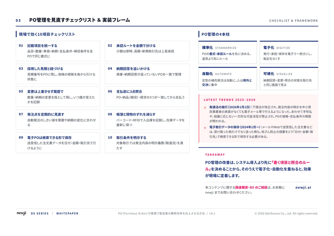
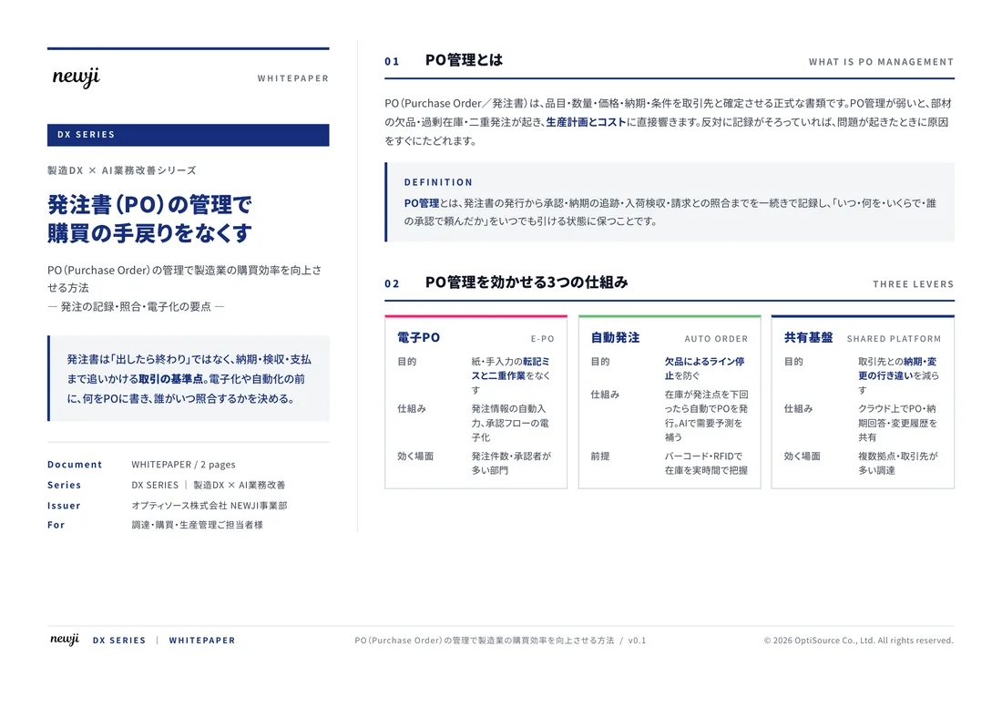
製造業の現場で使える実務資料(PDF)を無料でお届けします。"こんな資料が届きます" ↓ 下のボタンからどうぞ。
FREE DOCUMENT — サービス資料(PDF・無料)
製造業の見積・受発注クラウド
「Newji one」とは
Newji one は、製造業の調達・受発注に特化したクラウド/AIエージェント。見積依頼・発注書作成・進捗管理・承認をひとつの画面に集約し、AIが比較と異常検知を担当。最後の「GO」だけ人が押す仕組みです。
▶ 製造業の見積・受発注クラウド「Newji one」を、資料で見る(PDF・無料)
- 見積〜発注〜納期を一元管理。催促・転記のムダをゼロに
- AIが相見積もり比較と異常検知。あなたは判断だけに集中
- 取引先は「招待」で完全無料。自社コストだけで取引先ごとデジタル化
※ 取引先から招待された企業様は完全無料でご利用いただけます

 NEWJI総研
 OEM/ODM 生産委託
 AI/DX支援
 見積・発注クラウド Newji one
受発注が増えるほど、入力・確認・催促が重くなる。
受発注管理を“仕組み化“して、ミスと工数を削減しませんか。
見積・発注・納期まで一元管理できます。